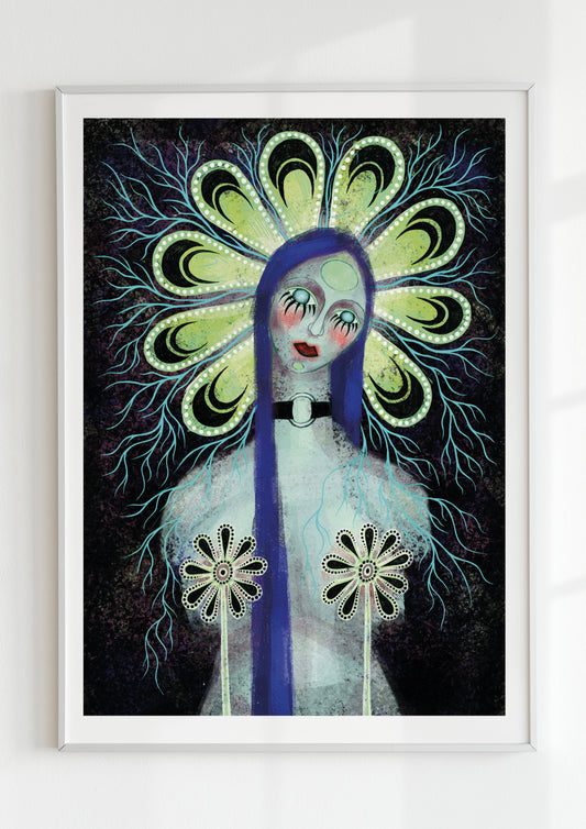
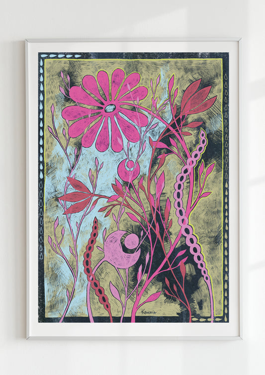
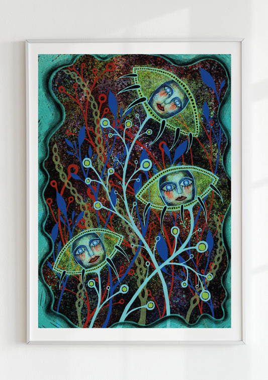
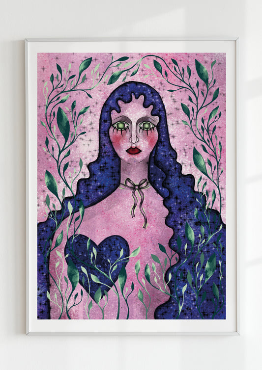
Color moves. Even when still on paper, it vibrates, collides, breathes. In modern art prints, color is no longer a background element — it’s a force, a rhythm, a pulse. It drives emotion the way music drives feeling: through contrast, repetition, and resonance.
When I work with bold chromatic compositions, I often think of color as an organism — alive, unpredictable, and deeply emotional. It can soothe or shock, whisper or scream. The way one hue leans into another creates tension, movement, even narrative. That’s where visual energy becomes psychological intensity.
Color as Emotion in Motion
From Kandinsky’s “visual music” to Rothko’s spiritual fields, artists have long used color as a direct language of emotion. In today’s modern art prints, that tradition continues with new immediacy — color as heartbeat.
A deep ultramarine can slow the gaze; a flash of vermilion can quicken it. The way hues overlap or repel one another creates rhythm — not in sound, but in sensation. Viewers don’t simply see color; they feel its tempo.

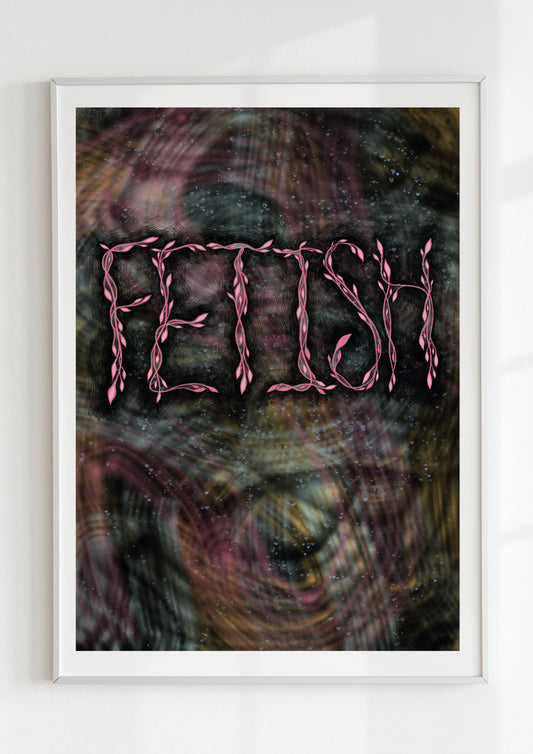
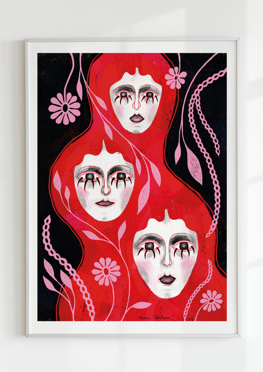
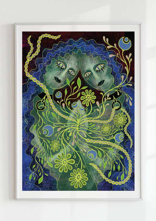
For me, each palette has a pulse of its own. Crimson burns fast; jade breathes slow. The contrast between them is like the syncopation of music — energy suspended between beats. That kinetic vibration is what transforms a static image into an experience.
Rhythmic Compositions and the Body’s Response
The human body reacts instinctively to visual rhythm. Fast contrasts — sharp edges, electric hues — stimulate alertness. Softer gradients and layered transparencies create calm. The dance between them generates what I call emotional architecture: a structured yet fluid dialogue between sight and sensation.
In a minimalist interior, a color-driven art print can shift the atmosphere completely. A strong red accent can introduce warmth where the room felt sterile; a sudden contrast of orange and blue can awaken depth in a pale space. Color is the easiest way to change not just aesthetics, but emotion itself.
When composing such prints, I think in terms of balance — how tension can exist without chaos, how movement can feel alive without becoming noise. The goal isn’t harmony; it’s resonance.
The Psychology of Contrast
Psychologists often describe color as one of the most immediate sensory triggers. We associate red with urgency, blue with distance, yellow with vitality, black with focus. But these meanings shift depending on combination and proportion.

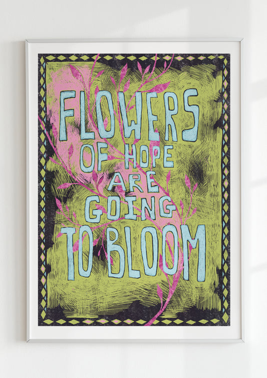
In modern art, contrast isn’t about clarity; it’s about dialogue. Two clashing tones can express ambivalence better than a single calm hue. They mirror the complexity of emotion — joy threaded with unease, peace touched by melancholy.
That’s why I’m drawn to high-contrast palettes. They feel honest. Life rarely happens in monotone — it happens in opposition, in the friction between light and dark, loud and soft, calm and eruption.
Color as a Living Pulse
Every artist has their own relationship with color — some rational, others instinctive. For me, it’s always physical. I can feel when a tone is too cold, when a composition needs heat. The palette has to breathe; it must have its own pulse.
In a way, I think of my prints as heartbeats translated into pigment. When viewers stand before them, I want them to sense rhythm — not literal movement, but the vibration of emotion layered in color.
The result is something between stillness and energy — that perfect threshold where the image seems to hover, alive yet silent.
When Color Becomes Experience
The true magic of modern color art lies in its ability to bypass interpretation. It doesn’t need narrative or symbolism to communicate. It works on the level of instinct — the oldest kind of understanding.

We don’t have to “read” color. We absorb it. And in that absorption, we momentarily synchronize with its pulse.
That’s why color never loses relevance. It’s universal, emotional, endlessly kinetic. It moves through us the way light does — reminding us that even silence can vibrate, that stillness can carry rhythm, that emotion can exist in pure hue.
