Vibrancy as Emotional Openness
The colourful aesthetic is more than a love of bright tones—it is a way of expanding emotional space. Saturated palettes bring a sense of openness that muted colours rarely offer. When I work with neon contrasts and intense hues, I’m not trying to overwhelm the viewer; I’m creating a field where emotion can move more freely. Vibrancy behaves like a release valve: the colours feel fast, warm, bold, and alive. They make room for impulses and inner states that resist containment. This freedom is not about maximalism alone, but about the way colour can dissolve boundaries and let expression feel instinctive rather than controlled.

How Saturation Changes the Emotional Temperature
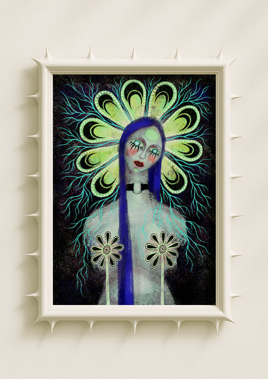
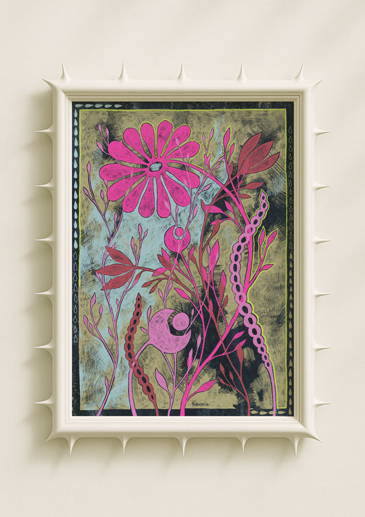
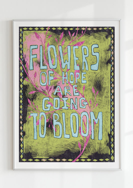
High saturation has a physical presence. Electric greens raise the tension in an image, while fuchsia or hot pink generates a sudden emotional lift. Deep cobalt, crimson, or neon teal create a sensory shift that feels almost somatic. In my work, saturated colour rarely sits still. I use gradients, soft noise, and textured transitions so the colour breathes and moves. The effect is not visual loudness but emotional immediacy. The colourful aesthetic invites the viewer into this immediacy: a moment where colour shortcuts the rational mind and reaches the intuitive one. Freedom appears in that switch from thinking to feeling.
Neon Contrasts and Surreal Energy
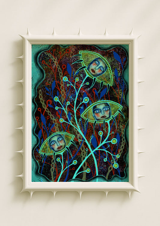
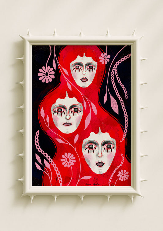
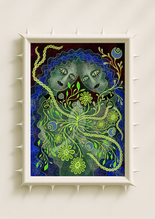
Neon contrasts create a type of surreal charge that defines much of my palette. When vivid pink meets acid green, or when violet hovers next to electric blue, the friction generates a spark. This spark is emotional, not decorative. Neon acts like a visual wake-up call, sharpening the shapes it touches—large patterned eyes, mirrored faces, floral structures with curved forms. These contrasts make the image feel alive, as if it’s in motion even when it’s still. The colourful aesthetic thrives on this tension between radiance and shadow, saturation and softness. The freedom comes from letting colour behave boldly without forcing it to resolve into harmony.

Symbolic Botanicals in Vivid Colour
Symbolic botanicals carry vibrancy well because their organic shapes soften the intensity of saturated hues. Petals outlined in neon, stems dipped in bright magenta, or flowers built from cobalt and coral become more than botanical forms; they become emotional signals. Vibrant botanicals speak to growth, renewal, and inner fire. Their colour fields are expressive without being aggressive. I often use speckled textures and soft stains to anchor neon hues so they feel organic rather than synthetic. This creates a balance where vibrancy feels fluid, not rigid. In the colourful aesthetic, flora becomes a language of motion—alive, intuitive, expressive.
Portraits That Glow from Within
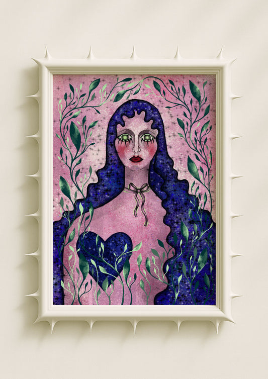
Faces can absorb saturation in ways that reveal emotional landscapes. When I pair soft, neutral expressions with hyper-saturated backgrounds or neon accents, the contrast creates a sense of interior light. Vibrancy lifts the emotional temperature without dictating a mood. Patterned eyes, mirrored profiles, and surreal features become more resonant when surrounded by bold hues. The colourful aesthetic in portraiture isn’t about loudness; it’s about atmosphere. Bright colour radiates behind a still face, giving the portrait a sense of interior freedom—a quiet emotion held within a vivid world.

Texture as a Pathway to Freedom
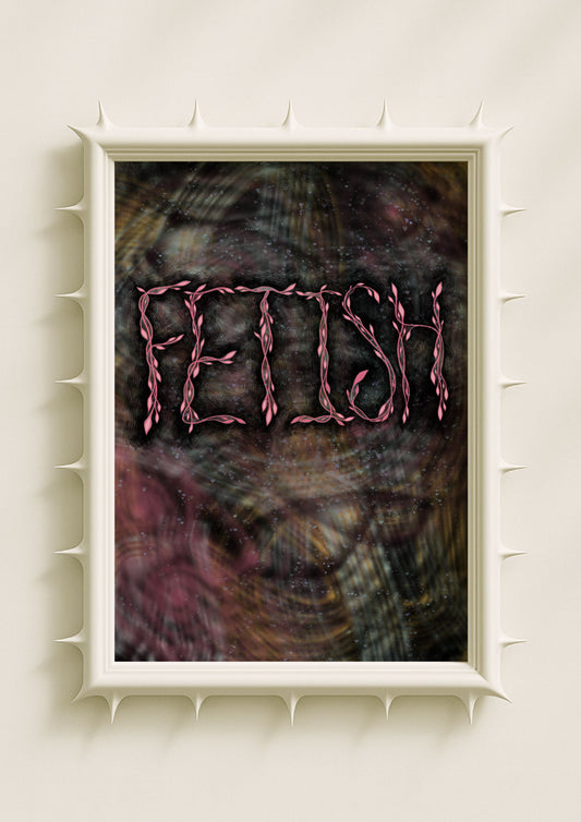
Texture is essential for grounding vibrant colour. Speckle, grain, and faint cracks give saturated palettes a lived-in quality that softens their edges. Without texture, neon can feel flat or overly sharp. Texture introduces breath into the colour field, allowing it to feel human rather than synthetic. This grounding effect is part of why the colourful aesthetic feels freeing: the colour becomes tactile, layered, and warm. Imperfections break the intensity enough to keep the imagery open and approachable. The result is vibrancy that feels expansive instead of overwhelming.
When Colour Becomes Movement
The colourful aesthetic works because bright tones behave like movement. Even on a still surface, saturation creates the illusion of flow: pink spilling into violet, green dissolving into teal, orange vibrating next to electric blue. These transitions mimic emotional shifts—impulsive, fluid, sometimes chaotic, but full of possibility. Vivid colours don’t lock the viewer into a single interpretation. They widen the field of meaning. That widening is its own form of freedom.

Vibrancy as a Contemporary Visual Language
Today’s colourful aesthetic is not tied to decoration or trend; it reflects a desire for emotional expansiveness. Saturated palettes allow imagery to carry complexity rather than hide it. Neon contrasts sharpen intuition. Textured gradients soften intensity. Symbolic botanicals and surreal portraits gain new emotional registers when surrounded by bold colour. Vibrancy feels like freedom because it resists quiet containment. It expands the visual world, offering a language where colour becomes movement, openness, and a form of expression that is both intimate and boundless.
