Why Colorful Aesthetic Prints Resonate Right Now
Colorful aesthetic prints have become one of the most recognisable visual languages in contemporary art. They speak to a desire for emotional clarity, intensity, and escapism all at once. People aren’t drawn to them simply because they’re bright—they’re drawn to how these colours feel. In my own work, I rely on bold palettes to express emotional states that aren’t easy to articulate: quiet tension, surreal gentleness, inner electricity. Colour becomes a way to build immediate connection. Whether the viewer encounters a surreal portrait or a symbolic botanical, the palette sets the emotional temperature before anything else is decoded.

The Emotional Logic Behind Bright Colour
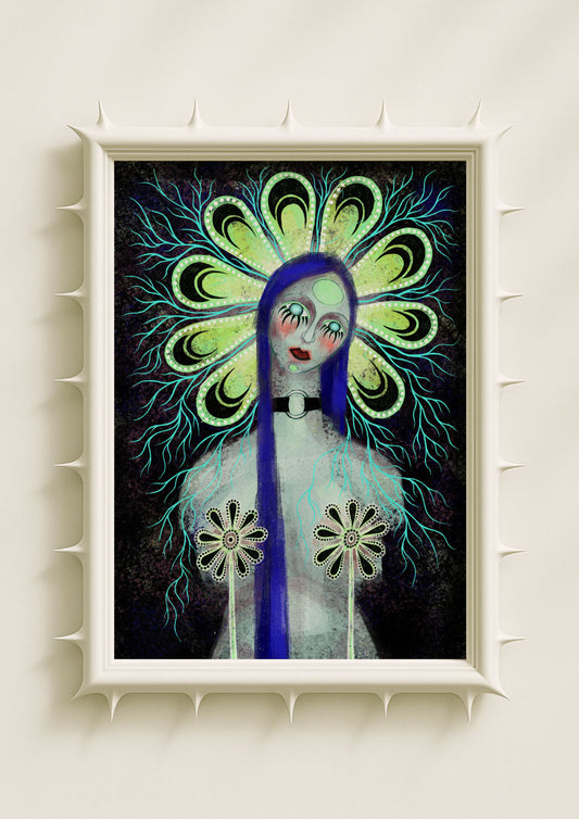
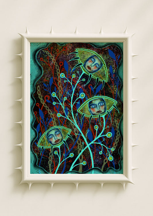
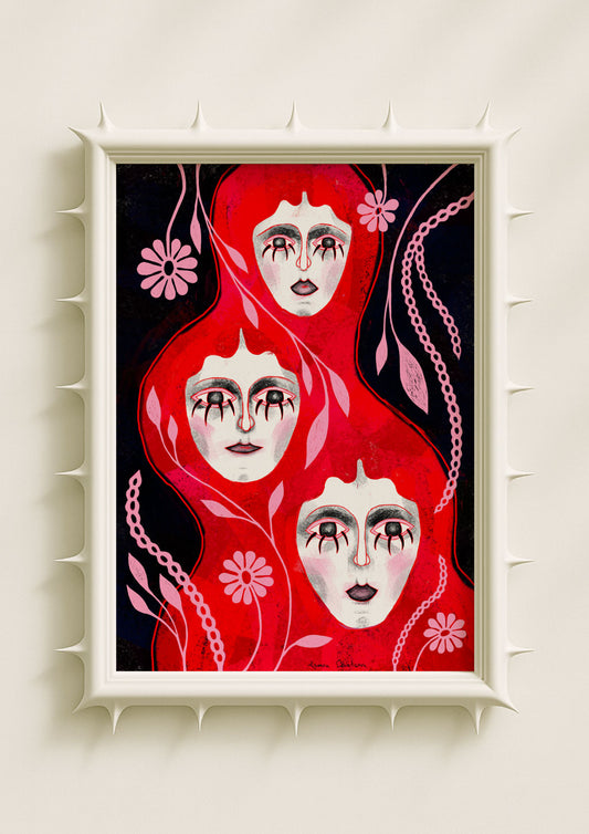
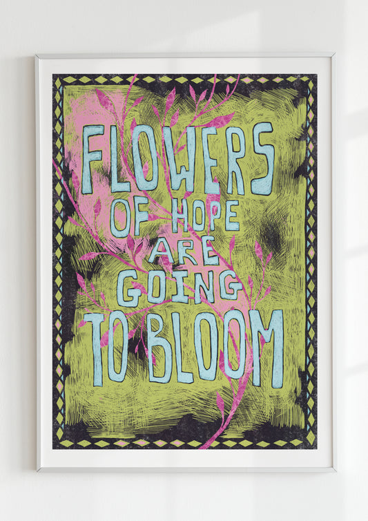
Bright colour isn’t random. It’s emotional architecture. When I use neon pink, cobalt blue, acid green, dusty lilac, or deep violet, each hue carries a specific emotional weight. Neon tones add urgency or alertness; pastels introduce calm; saturated colours create energy and density. Contemporary bright-art prints rely on this emotional range. The colours aren’t there to decorate—they’re there to communicate. In my practice, I treat the palette as the first layer of meaning. A portrait with teal skin feels introspective, while a botanical with neon outlines becomes immediately alive. Colour becomes the emotional entry point into the artwork.
Why Bright Art Feels Intimate, Not Loud
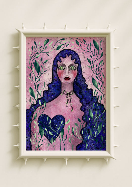
Even when the palette is intense, colorful aesthetic prints can feel intimate. The brightness doesn’t erase softness; it can create it. A surreal face rendered in cobalt or mauve feels quiet when surrounded by grainy texture. A neon halo around a botanical form becomes more contemplative when placed on a dusty background. Contemporary viewers are drawn to prints that feel both electric and gentle—pieces that offer intensity without aggression. I navigate this balance by pairing bold colour families with still expressions, calm symmetry, or atmospheric texture. The result is bright art that feels emotionally grounded.

Symbolic Botanicals Inside Colorful Worlds
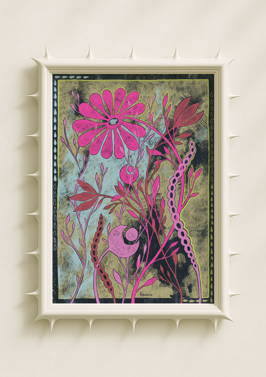
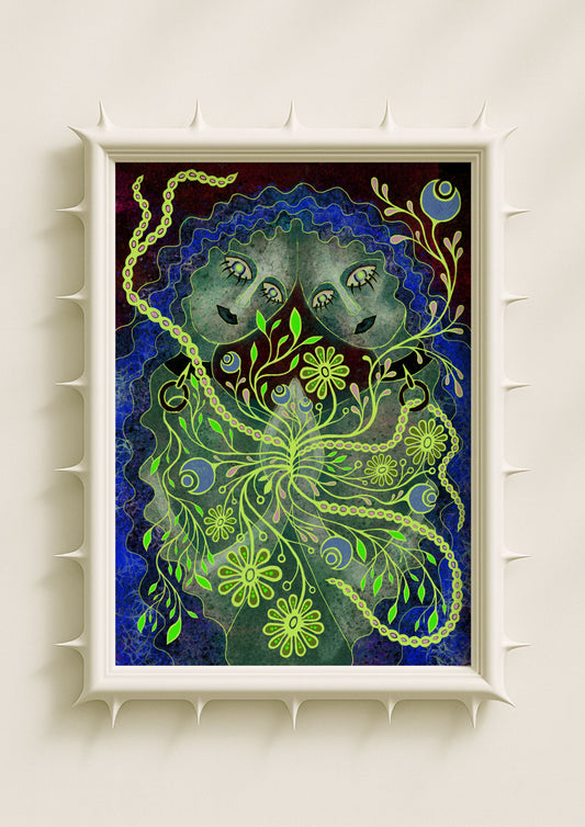
Colorful aesthetic prints often rely on botanical symbolism to maintain emotional cohesion. Flowers are intuitive to read, even when transformed into surreal shapes. In my work, botanicals help soften the brightness of the palette. Acid green petals outlined in neon, mirrored stems in dusty rose, surreal blooms in cobalt or lavender—these forms create emotional rhythm within the bold colour fields. Botanicals give the viewer something familiar to hold onto while allowing the palette to stay expressive and unconventional. Contemporary bright-art trends lean heavily on this mix of familiarity and imaginative colour logic.
Texture as the Anchor of Bright Colour
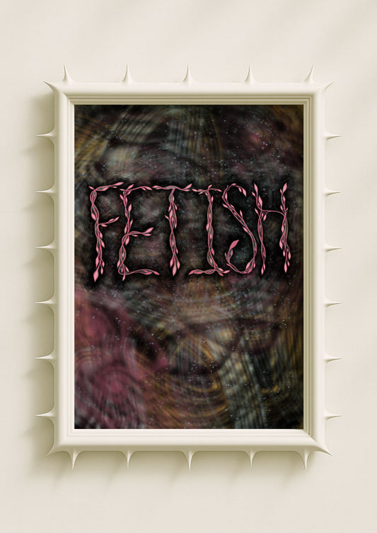
Texture prevents colourful prints from becoming flat or overly polished. When I add grain, speckle, stains, or dusty gradients, the colours settle into the composition more naturally. Bright hues gain atmosphere instead of competing for attention. Texture makes the palette feel lived-in, turning neon tones into emotional weather rather than glossy surfaces. This interplay between colour and texture is one reason bright-art aesthetics perform so well in contemporary visual culture: the images feel real, grounded, and emotionally honest, even when the colours are surreal.

Why Colorful Aesthetic Prints Thrive in Digital Spaces
The rise of colorful aesthetic prints is closely tied to digital culture. Bright colours translate well on screens, but the deeper reason is emotional. People seek visual environments that feel expressive, personal, and alive. Contemporary bright-art aesthetics offer exactly that. They feel like a mirror to inner experience—vibrant, layered, shifting. As a female indie artist, I find that bold palettes help me communicate my own interior worlds in ways that feel accessible to viewers online. Colour becomes a bridge between physical and digital presence.
The Personal Side of Bright-Art Expression
Colorful aesthetic prints often become personal to the viewer because they speak through feeling rather than narrative. A surreal portrait with neon accents might remind someone of a part of themselves that is curious or restless; a botanical with glowing outlines might evoke quiet transformation. In my practice, colourful maximalism isn’t about aesthetics alone—it’s about emotional honesty. Bright colour helps me express the parts of my personality that sit between softness and intensity. It turns surreal imagery into something the viewer can feel rather than decode.

How I Build Harmony in Bright, Layered Palettes
Harmony in colorful aesthetic prints comes from deliberate decisions, not randomness. I balance neon against dustiness, saturated tones against pale washes, symmetrical forms against textured backgrounds. The goal is not perfection—it’s coherence. I want the viewer to feel held inside the colour, not overwhelmed by it. When the palette becomes electric, the composition becomes calm; when the colour grows softer, the textures become more active. This tension produces harmony that feels emotional rather than formal.
Why Colorful Aesthetic Prints Continue to Matter
Colorful aesthetic prints are more than a visual trend—they are a way of articulating emotional realities that don’t fit within muted palettes. They allow artists to embrace surrealism, symbolism, and emotional depth while maintaining accessibility. For me, working with bright-art aesthetics is a way to honour internal intensity without flattening or simplifying it. Colour becomes a language that can hold multiple truths at once—joy and introspection, calm and electricity, softness and strangeness. And that is why colourful aesthetic prints continue to resonate so strongly today.
