When Language Shifts from Meaning to Presence
There is a moment in contemporary art when language stops behaving like information and begins to act like energy. A word no longer functions as something to read but as something to feel. This shift happens through typography — when letters are shaped, textured, and illuminated in ways that detach them from literal meaning. Instead of definitions, they carry atmosphere. Instead of messages, they hold emotional charge. In this state, words become symbols: compact emotional codes that invite intuition rather than comprehension.
Letters as Shapes with Emotional Gravity
In symbolic typography, each letter becomes a shape first and a letter second. Curves hold softness, yielding and fluid; sharp angles carry tension, awakening, or clarity; wide forms feel grounding, while narrow ones become ethereal. When I design text within an artwork, I treat each letter as a small body moving through a visual environment. The arch of an “m,” the openness of an “o,” the verticality of an “l” — all these gestures contribute to the emotional tone. Typography becomes choreography, creating a rhythm that the viewer senses before they parse the word.

Words as Spellwork
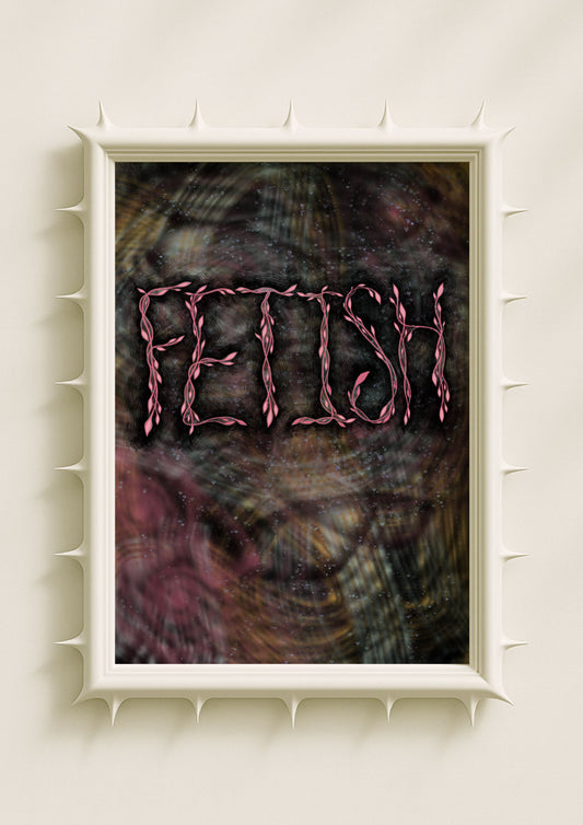
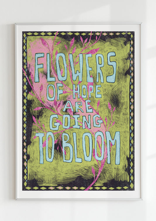
When we encounter a word presented inside layered textures or glowing chromatic fields, it no longer behaves like a neutral message. It becomes a spell — an intention condensed into form. This spellwork is subtle: it comes through the way the word is shaped, the way it glows, the way it dissolves at the edges or emerges from shadow. A word like “shift,” “bloom,” or “root” carries emotional resonance not because of what it means in language, but because of how it is placed in space. Typography becomes ritual logic, a visual invocation that shapes mood and attention.
Colour as Emotional Code
Colour transforms symbolic typography into emotional vocabulary. A word set in auric gold feels sacred and clarifying. A word glowing in pollen yellow feels restless and awake. A word immersed in moonglow blue evokes introspection and quiet intuition. In my artworks, colour is not an accessory to the text; it is the emotional frequency that brings the word to life. The chromatic field determines how the viewer receives the word — whether as warmth, softness, alertness, or inner movement. Through colour, typography becomes a pulse rather than a label.

Texture as the Breath of the Word
Texture gives symbolic typography its living quality. Grain, noise, speckle, shadow haze, or soft blur wrap the letters in subtle emotional narrative. A rough, grainy letter suggests memory or friction. A velvety blurred letter evokes calm and vulnerability. A fragmented, noisy word hints at inner complexity or transition. Texture turns language tactile, giving it depth and breath. Instead of reading a word, the viewer experiences its emotional surface — the way it feels to the inner self.
When Words Dissolve into Imagery
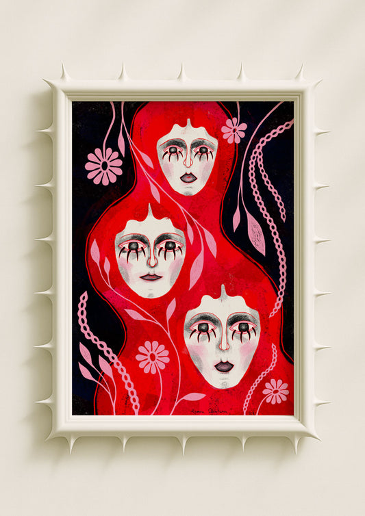
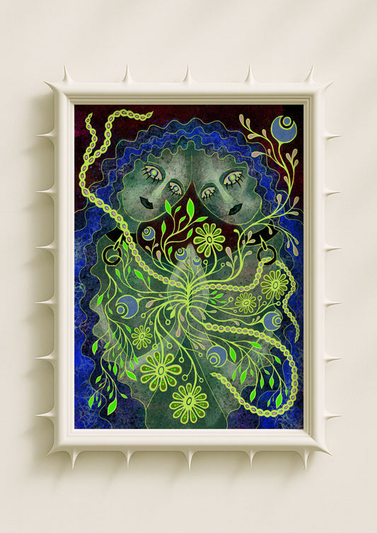
One of the most powerful aspects of symbolic typography is its ability to dissolve seamlessly into surreal worlds. In my work, letters often slip into botanical elements, echo the curve of a petal, mirror a root, or emerge from glowing seeds. They behave like natural forms, as though the text grew from the same emotional soil as the imagery. This integration softens the boundary between language and visual sensation. The word becomes part of a larger symbolic ecosystem, a subtle presence that reinforces the artwork’s emotional logic.

The Silent Power of Minimal Language
Symbolic typography often relies on minimal language — single words, small phrases, or fragmented marks. These small linguistic gestures carry surprising emotional weight. The fewer the words, the stronger the impact. Minimal text allows the viewer to fill the space with their own emotional history. It creates an open field where meaning becomes fluid, personal, and intuitive. A single symbolic word can anchor a room, shift its atmosphere, or mirror a moment of inner transformation.
Words as Emotional Portals
When typography is shaped, coloured, and textured with intention, words become portals rather than statements. They open emotional movement rather than closure. They invite the viewer inward rather than outward. This is the essence of visual magic: the ability of language to transcend meaning and enter the realm of sensation. In this form, words behave like omens, signals, or soft spells that weave into the emotional landscape of both the artwork and the room it inhabits.
Why Symbolic Typography Matters
In a world saturated with literal language, symbolic typography offers an alternative way of experiencing words — one that is quieter, more intuitive, and more emotionally alive. It brings together visual sensation, inner psychology, and subtle ritual. It transforms a poster or art print into an object with presence, not just decoration. When words become symbols, they speak directly to the emotional body. They remind us that language does not always need to be explained; sometimes it only needs to be felt.
