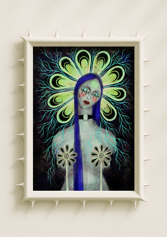
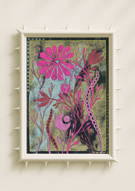
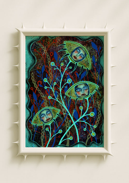
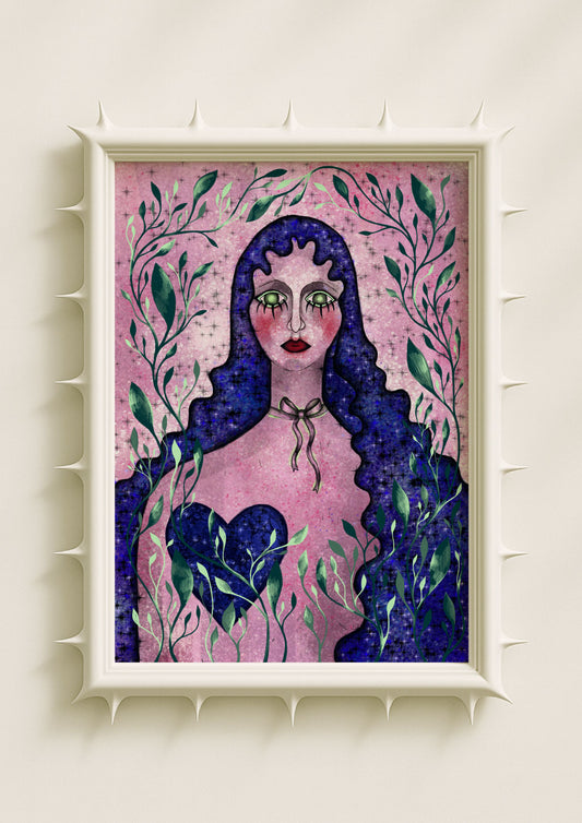
Not all art whispers. Some works shout, exaggerate, and disrupt. Posters, more than any other medium, have long embraced vulgarity—not as tastelessness, but as an aesthetic of excess. Bold typography, lurid palettes, and raw imagery defy refinement and instead demand attention. In wall art, this vulgarity is not weakness but power: a deliberate break with silence.
The Shock of Typography
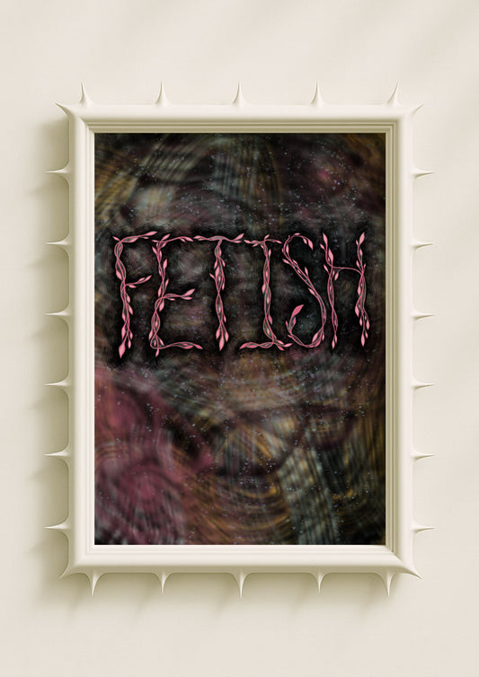
Typography can shout as loudly as any image. Oversized fonts, words that sprawl across the frame, jagged lettering that refuses elegance—these elements are not accidents, but deliberate disruptions. In poster design, vulgar typefaces echo the urgency of protest, the immediacy of street flyers, the visual noise of underground culture.

A symbolic poster with such typography does not blend into décor. It dominates, insisting that words themselves can be visual gestures, carrying aggression, irony, or crude honesty.
Bold Palettes as Excess
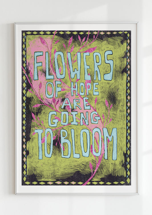
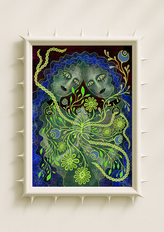
Color is another form of vulgarity. Fluorescent pink, toxic green, blistering red—palettes once dismissed as garish find their place in outsider and pop art traditions. These colors are not chosen for harmony but for assault. They challenge the eye, overwhelm interiors, and flood perception with intensity.
To hang a neon poster in a living room is to embrace confrontation. It transforms the wall into a stage of unapologetic energy, where vulgarity becomes exuberance.
Imagery Without Restraint
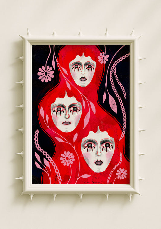
Vulgar imagery often draws from the body, the grotesque, the exaggerated. Outsider artists and punk aesthetics have long used crude drawings, distorted faces, and sexualized or absurd motifs to reject refinement. In wall art, these images occupy a space of resistance.

A poster showing oversized lips, a screaming mouth, or cartoonish figures rendered in brutal simplicity may seem offensive at first glance. Yet they embody truthfulness: an honesty unmediated by politeness.
Outsider Art and the Refusal of Elegance
Outsider art, often created outside academic traditions, thrives on this refusal of elegance. It revels in directness, naiveté, and raw impact. Posters inspired by outsider aesthetics often carry hand-drawn letters, uneven composition, or chaotic layering. These choices break with professional polish, but in doing so, they produce a human immediacy that sleek design cannot.
Symbolic wall art in this vein does not aspire to perfection. It insists on imperfection as expression, on vulgarity as authenticity.
Vulgarity as Atmosphere
In interiors, vulgar posters create friction. They make rooms less neutral, less safe. A bedroom softened by pastels may suddenly acquire edge with one garish print; a kitchen filled with botanical calm may be interrupted by a fluorescent typographic scream. This tension is not decoration but discourse.
Vulgarity in posters reminds us that home décor need not always soothe—it can provoke, disturb, and energize.
Shouting Walls
To embrace vulgarity in posters is to embrace walls that shout. It is to accept that interiors, like identities, are not always polite or harmonious. Sometimes they are unruly, excessive, and loud.
Typography that sprawls, colors that clash, imagery that unsettles—these are not failures of taste but strategies of impact. They remind us that art is not always a whisper. Sometimes it is a scream, and sometimes that scream is precisely what the room needs.
