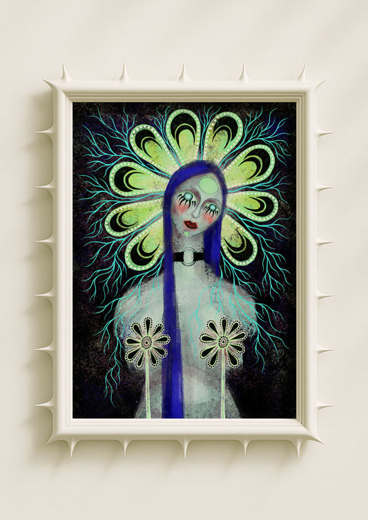
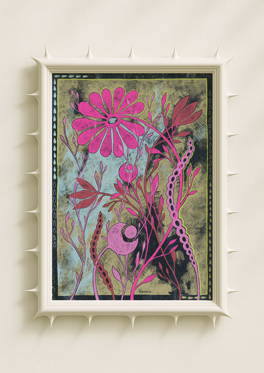
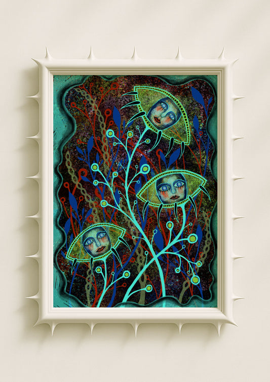
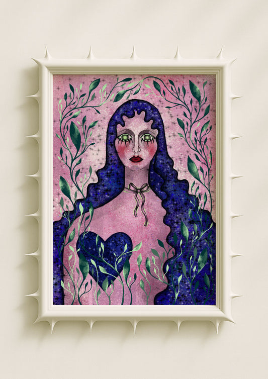
In contemporary painting, much depends on balance—the tension between fluidity and structure, chaos and clarity. One of the most effective ways to achieve this balance is through the use of markers and liners, which bring a graphic sharpness to otherwise flowing or organic compositions. In original paintings, especially those rooted in surreal or botanical aesthetics, these tools transform soft color into symbols, giving the subconscious a distinct outline.
The Role of Line in Expression
Line is not only technical; it is symbolic. A single stroke can separate one form from another, or it can bind them together. In outsider and surrealist traditions, line often works against realism, carving through forms to exaggerate, distort, or highlight the unexpected.

Markers and liners make this process immediate. Their precision contrasts with the unpredictability of watercolor washes or acrylic textures. The result is an aesthetic where emotions spill into form but remain legible, contained by sharp contours.
Graphic Contrast with Organic Chaos
When working with fluid media—watercolors that bleed, metallic paints that shimmer unpredictably—markers and liners provide necessary structure. They prevent the work from dissolving entirely into abstraction, offering edges where the eye can rest.
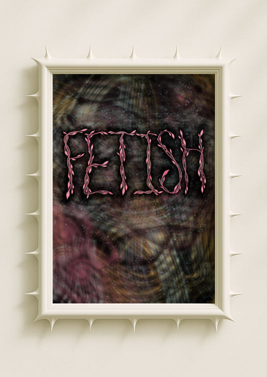
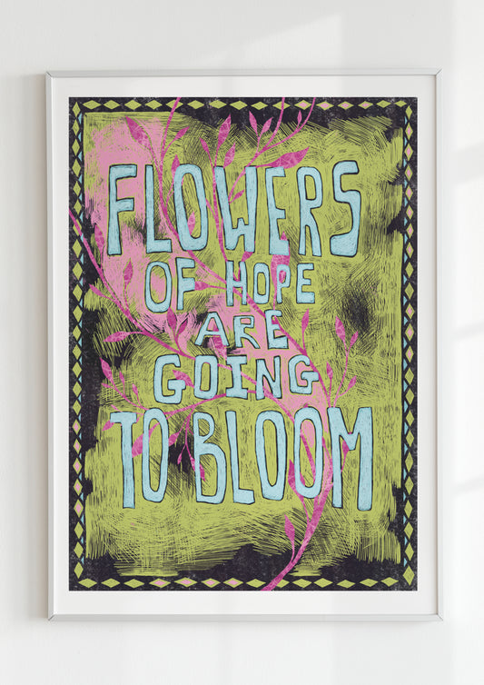
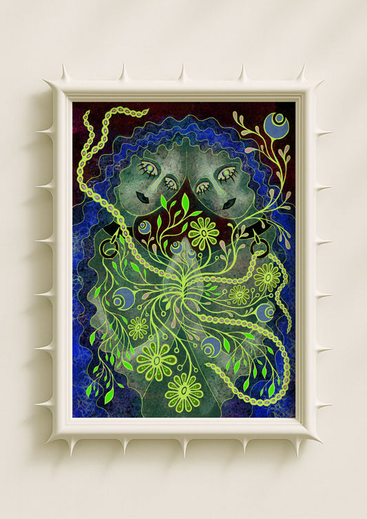
This graphic sharpness does not tame the organic but intensifies it. Flowers outlined in fine black or metallic lines feel more surreal, their strangeness heightened rather than reduced. Shapes acquire rhythm and intention, turning chaotic growth into symbolic language.
Outsider Energy and Dreamlike Forms
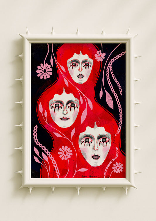
For artists working in the realm of dreamcore, gothic, or outsider aesthetics, markers and liners become tools of emphasis. A bouquet that feels untamed can suddenly become a collection of eyes, mouths, or symbols, simply through the clarity of outline.

This technique amplifies the tension between control and surrender: paint spreads unpredictably, but the line reclaims it. What emerges is a dreamlike balance—fluid visions encased in graphic precision.
Impact on Wall Art and Interiors
In wall art and symbolic posters, this graphic quality resonates strongly in interiors. Sharp lines punctuate color, allowing dreamlike forms to remain legible in a room. They invite both close inspection and distant reading: from afar, the painting feels alive with rhythm; up close, every detail of the liner’s stroke reveals intention.
For modern interiors, this duality is powerful. The softness of watercolor or acrylic invites atmosphere, while the marker’s outline creates clarity—an interplay that makes the work both expressive and structured.
Why Graphic Sharpness Matters
The use of markers and liners is not merely stylistic—it is philosophical. It reflects the need to navigate between chaos and clarity, between subconscious flow and conscious structure. In original paintings, these lines act as anchors, keeping dreamlike forms tethered without diminishing their energy.
Graphic sharpness ensures that even the most surreal or botanical imagery can communicate clearly, carrying its symbolism into the world of interiors. It is the edge that makes the fluid legible, the gesture that turns abstraction into language.
