When Text Becomes Part of the Atmosphere
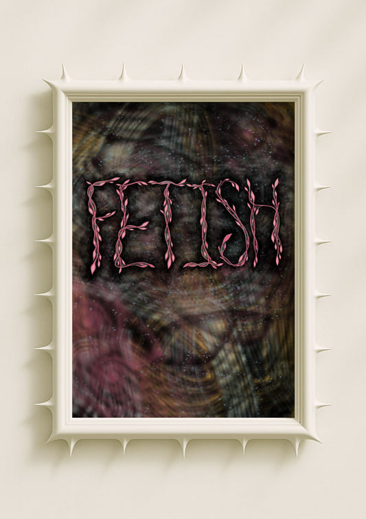
In maximalist art, typography behaves in a completely different way than in minimalist or graphic design traditions. Instead of sitting on top of the image, the words dissolve into the artwork’s density. They blur into grain, drift into shadow, or glow from deep colour fields. The text no longer feels like an addition — it becomes part of the atmosphere itself. This integration transforms language from something decorative into something emotional, something felt. The words enter the same world as the textures, motifs, and colour rituals, turning the artwork into a layered sensory experience.
The Emotional Weight of Layered Letters
Layering is central to maximalist expression. When letters overlap with glowing botanicals, shadows, or chromatic gradients, they gain emotional depth. A word half-absorbed into a textured field feels whispered. A word emerging through noise feels like a memory resurfacing. A word glowing at the center of dense colour carries the weight of intention. The more the text interacts with its surroundings, the more the viewer becomes aware of its emotional undertone. Layering gives typography a new voice — subtle, symbolic, and charged.

Colour Fields as Emotional Carriers
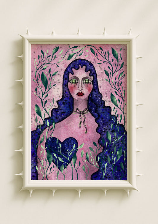
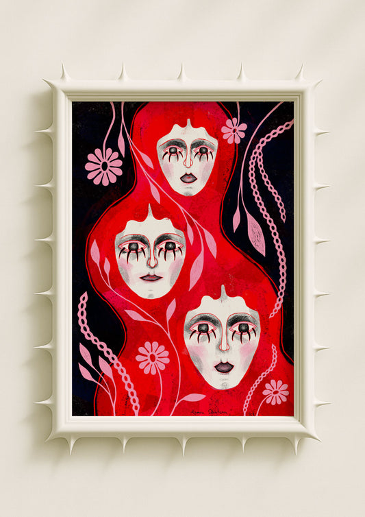
In my maximalist compositions, colour fields are not backgrounds; they are emotional landscapes. When typography enters these fields — whether a velvet black gradient, an auric gold wash, or an acid-green ripple — the letters adopt the emotional logic of the colour. A soft rose field creates tenderness around the text. A deep violet one adds introspection. A moonglow-blue gradient evokes inner quiet. These colour atmospheres shift the meaning of the words, allowing language to become fluid, adaptive, and emotional rather than literal.
Texture as a Living Element
Texture is one of the most powerful tools in maximalist typography. Grain, dust, noise, and layered shadows give letters physicality. They feel touched, breathed on, altered by time. A textured letter does not simply exist — it lives. It carries the pulse of the artwork around it. In my work, texture forms tiny emotional cues: rough grain suggests friction or memory; soft blur evokes calm; fragmented noise hints at internal complexity. Typography becomes a body rather than a symbol, something that feels human in its imperfection.

Words Inside Botanical Surrealism
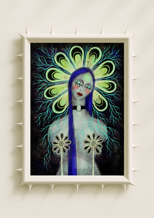
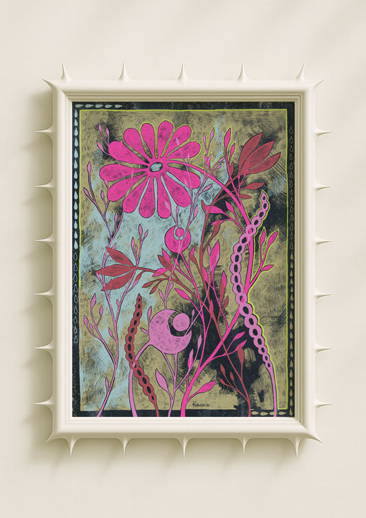
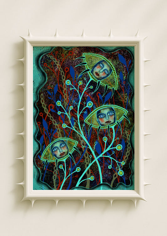
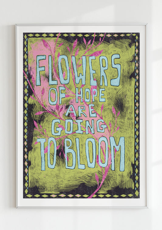
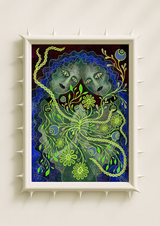
Botanical forms create one of the most compelling environments for text to live in. When words are placed among glowing petals, mirrored leaves, or ritualistic seeds, they become part of a symbolic ecosystem. A single phrase next to a luminous bloom feels like a quiet invocation. Letters that nestle into roots or dissolve into vines suggest a sense of inner growth. These interactions make the typography feel organic, as if the word itself were a living part of the botanical landscape. Maximalist florals and typography together create emotional depth — a blend of symbolic nature and intuitive language.
Emotional Saturation Through Density
Maximalism invites density: many layers, many textures, many tonalities. When typography enters this density, it gains emotional saturation. A heavily layered composition allows the viewer to feel the word rather than simply read it. The visual richness creates a sense of immersion where language becomes sensation. This saturation is not overwhelming; it is grounding. It creates a moment of emotional clarity inside the chaos of the visual field. That contrast — the softness of text within maximalist intensity — makes the typography resonate more deeply.
When Text Behaves Like Light
In many pieces, typography functions like a source of illumination. Letters glow from within, radiating outward. This glow transforms the text into a quiet ritual, a symbolic anchor inside the artwork. When the text behaves like light — soft, warm, pulsing — it becomes a focal point that draws the viewer into the piece. This luminous quality turns the word into a portal-like experience, guiding emotion and attention without demanding literal interpretation.

The Intuitive Presence of Text
Typography in maximalist art feels intuitive rather than instructional. The words do not impose meaning; they create emotional openings. They act as subtle invitations to pause, breathe, or recognise something familiar. This intuitive presence is what makes text-based maximalist posters so powerful in modern interiors. They hold emotional energy without dominating the space. They whisper instead of shout. They blend instead of announce.
Why Maximalist Typography Matters
Typographic maximalism offers a way to experience language as atmosphere rather than instruction. It transforms words into sensory events — layered, textured, emotionally charged, and symbolically alive. This approach aligns with contemporary desires for deeper emotional interiors: rooms that feel expressive, intuitive, and connected to the inner world. When text merges with colour, texture, and surreal botanical forms, it becomes more than a message. It becomes a feeling. It becomes a ritual. It becomes an emotional impact that lingers in the space long after the viewer has looked away.
