Why Bold Outlines and Soft Skin Exist Together
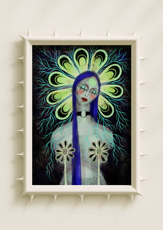
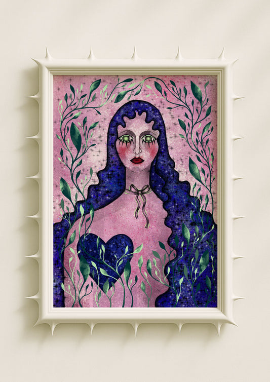
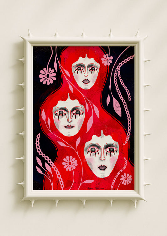
In my artwork, the tension between graphic outlines and soft, muted skin tones is intentional. I rely on strong outlines not to harden the image, but to create a structural clarity that frames vulnerability. The skin inside those outlines often remains pale, powdery, or delicately shaded, creating a visual contrast that feels intimate rather than harsh. This combination allows the figure to appear both defined and tender, both present and slightly otherworldly. It becomes a way to show emotional sharpness around something inherently soft.

Outlines as Emotional Architecture
The graphic lines in my work act like architecture. They hold the figure in place, give shape to ambiguity, and create the outer rhythm of the composition. These outlines are rarely thick or heavy for the sake of style alone; they provide a way to anchor the viewer in a surreal environment. Even when the rest of the image dissolves into gradients or delicate colour washes, the outlines keep the portrait or the botanical grounded. They create a clear contour that the viewer can follow, stabilising the piece without reducing its sensitivity.
Soft Skin Tones as a Counterbalance
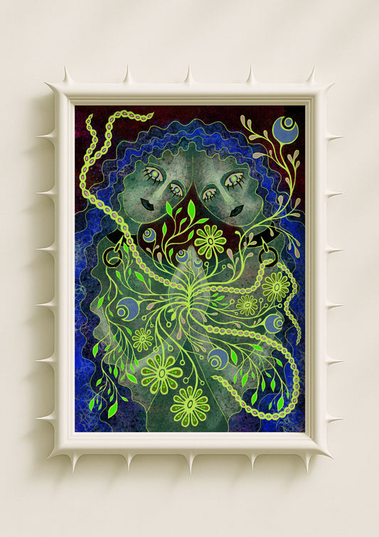
The skin tones in my portraits often feel like another world compared to the outlines. They appear powdery, blurred, washed with faint blush tones or gentle undertones of blue and green. These colours are subtle but emotionally loaded: they evoke fragility, warmth, introspection, or quiet presence. Soft skin slows down the visual rhythm of the artwork. It absorbs the viewer rather than confronting them. As a result, the artwork gains a sense of calm even when the palette surrounding it is bold or surreal.

When Hard Meets Soft: Creating Emotional Depth
The combination of graphic outlines and soft skin tones creates depth by contrast. The outline points outward — it directs attention, defines shape, and carries clarity. The soft skin points inward — it holds emotion, texture, and introspection. When placed together, they create a dialogue within the portrait. The figure looks more dimensional not because of realistic shading, but because of the interplay between a firm boundary and a gentle interior. It mirrors real emotional experience: we often build strong exteriors around delicate inner worlds.
Colour as Narrative Between Line and Skin
The transition between outline and skin tone is never accidental. Sometimes I allow the line to fade or break where the figure feels more vulnerable. Other times, I keep it sharper near features that carry intensity, like the eyes or the jaw. The skin colours inside those borders shift according to the mood of the piece. Blues may suggest emotional distance, pinks may reveal sensitivity, and subtle greens may create a surreal glow. These decisions shape how the viewer experiences the figure — not just visually, but emotionally.

How This Contrast Defines My Surreal Style
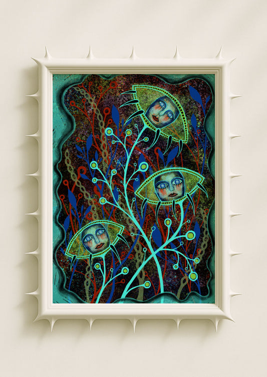
Many surreal artworks rely on distortion alone, but my approach depends equally on structure and softness. The graphic outline maintains clarity inside a dreamlike world; the soft skin gives that world emotion. This contrast has become one of my visual signatures. It allows the surreal elements — hybrid botanicals, symbolic gestures, unusual proportions — to remain anchored without losing their emotional charge. The artwork feels both precise and atmospheric, both designed and personal.
Why Viewers Respond to This Combination
People often describe these portraits as calm, intimate, or strangely comforting. The strong outline creates a sense of stability, while the soft skin tones invite the viewer closer. Together, they evoke a feeling of being held and observed gently. This balance between hardness and softness mirrors the complexity of human emotion, which is why the visual language resonates so deeply.
In my work, the outline is the structure and the skin is the soul. Their relationship shapes the emotional world of each piece.
