Why Folk-Inspired Colour Feels So Contemporary
Colorful folk-inspired posters have surged in visibility because they offer a bridge between heritage and imagination. They carry the clarity of folk structure—symmetry, repetition, symbolic shapes—while embracing the emotional voltage of contemporary colour. In my work, this fusion feels almost inevitable. I’m drawn to the stability of folk composition, but I reshape it through neon outlines, acidic hues, and surreal portraiture. The result is a form of folk-inspired art that feels both rooted and electric, something familiar yet unmistakably contemporary.

Folk Symmetry as a Visual Anchor
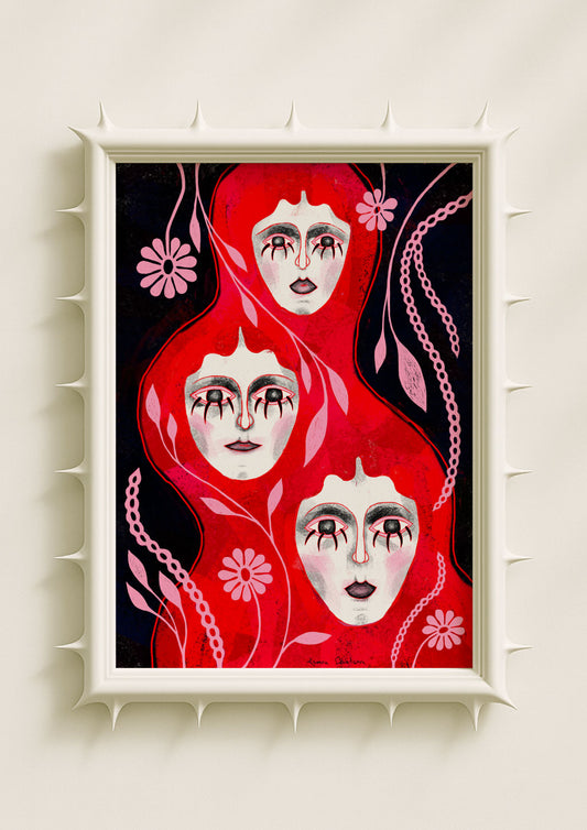
Traditional folk art often relies on mirrored layouts, centered figures, repeated botanicals, and rhythmic ornaments. These structures hold emotional meaning: balance, protection, continuity, ritual. When I draw on this lineage, symmetry becomes a stabilising force inside my more eccentric palettes. A mirrored flower, a doubled petal, a circular halo of dots—these motifs organise the intensity of neon pink, cobalt blue, acid green, or mauve. The folk framework acts like a spine. It allows the brightness to feel intentional rather than overwhelming, turning the poster into a coherent emotional field.
Psychedelia Through Colour, Not Chaos
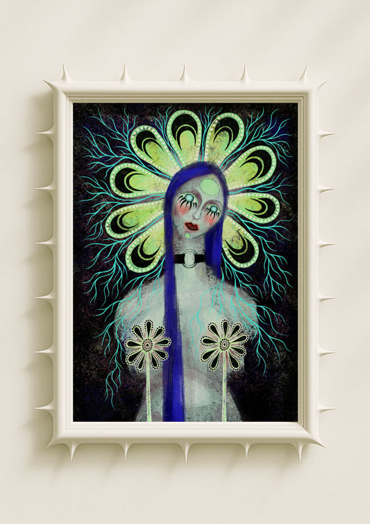
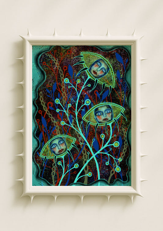
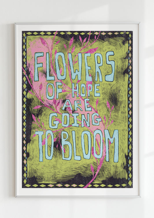
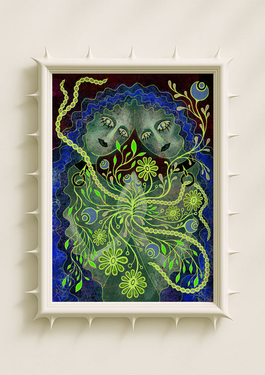
The “psychedelia” in my folk-inspired prints doesn’t come from distortion or noise; it comes from colour logic. Neon greens, electric blues, saturated violets, dusty pinks and glowing whites shift the traditional folk vocabulary toward something surreal and dreamlike. These tones heighten emotion without erasing structure. A flower becomes more symbolic when outlined in neon; a face becomes more mystical when surrounded by glowing symmetry. Colorful folk-inspired posters thrive on this interplay: old shapes carried by new intensity.

Symbolic Botanicals Reimagined in Bright Palettes
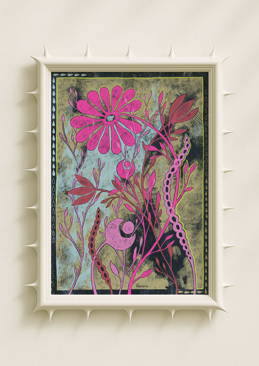
Folk art has always used botanicals as carriers of meaning—growth, protection, cycles, seasons. I extend that tradition by altering the forms. Leaves become mirrored structures; petals turn into geometric shards; halos form from dots and rings; flowers glow as if lit from within. Bright colour transforms these symbols emotionally. Acid green makes growth feel restless and immediate. Lavender softens the composition into introspection. Cobalt adds clarity and inner distance. When these colours sit inside folk symmetry, the result feels both ceremonial and contemporary.
Portraiture at the Intersection of Folk and Surreal
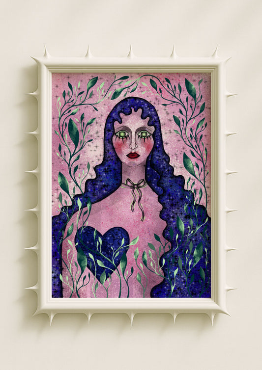
Faces in folk-inspired posters traditionally appear stylised, stable, emblematic. In my work, I keep the calm expression and centered placement, but the palette pushes the portrait into surreal territory. Skin can turn teal or mauve; shapes around the eyes can glow; backgrounds shift into neon-tinted gradients. The folk logic keeps the portrait grounded while the colour expands the emotional register. This coexistence—stillness inside intensity—is why colorful folk-inspired posters resonate so strongly today.

Texture as a Link to Hand-Crafted Traditions
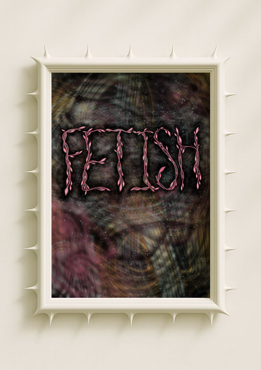
Folk art historically carries texture: wood grain, fabric weave, brush marks, carved lines. I echo this through digital texture—grain, speckle, stains, dusty transitions. These layers anchor the bright colour and prevent it from feeling synthetic. The poster gains a tactile quality that hints at craft, ritual, and handmade heritage, even when the palette is futuristic. Texture softens neon, warms symmetry, and creates atmosphere around the structured forms.
Why Colorful Folk-Inspired Posters Feel Emotionally Rich
This aesthetic works because it blends two emotional languages. Folk motifs bring reassurance, stability, and symbolism; psychedelic colour adds curiosity, intensity, and quiet strangeness. Together, they create a space where the viewer can feel grounded and transported at once. In my practice, this fusion mirrors my own relationship with heritage and imagination. I work with motifs that feel timeless, but I reshape them through saturation and surrealism to express states that belong to the present moment.

How I Build Harmony Between Tradition and Bright Colour
Harmony emerges through restraint and clarity. I let folk symmetry organise the palette. I choose one or two areas for neon intensity and let the rest breathe with dusty gradients or softer tones. I place textured black near the center to balance electric hues. This method keeps the poster emotionally focused, even when the colours are bold. The goal is not nostalgia and not pure psychedelia—it’s something in between, something that feels lived-in, symbolic, and quietly charged.
Why This Folk-Inspired Aesthetic Continues to Rise
Colorful folk-inspired posters resonate because they offer meaning without rigidity and brightness without superficiality. They feel personal, emotional, and symbolically rich. They give viewers a sense of ritual and imagination at the same time. For me, this approach allows my surreal portraits and botanicals to connect with a deeper visual lineage while staying true to my contemporary palette. It’s a language that holds past and present together—and that tension is what keeps the aesthetic alive.
