How Intuition Shapes My Colour Choices
Colour theory is often taught as structure, logic, and rules—but my palette almost never begins that way. It starts with a feeling, a frequency, a subtle emotional temperature that appears before any composition does. When I choose colours, I’m not looking for harmony in the technical sense. I’m looking for emotional coherence. The palette becomes a lens through which the figure or botanical form can breathe. This is what an intuitive colour palette means in my practice: trusting the emotion first, and allowing the theory to follow quietly behind it.
Emotional Colour as the First Layer of Meaning
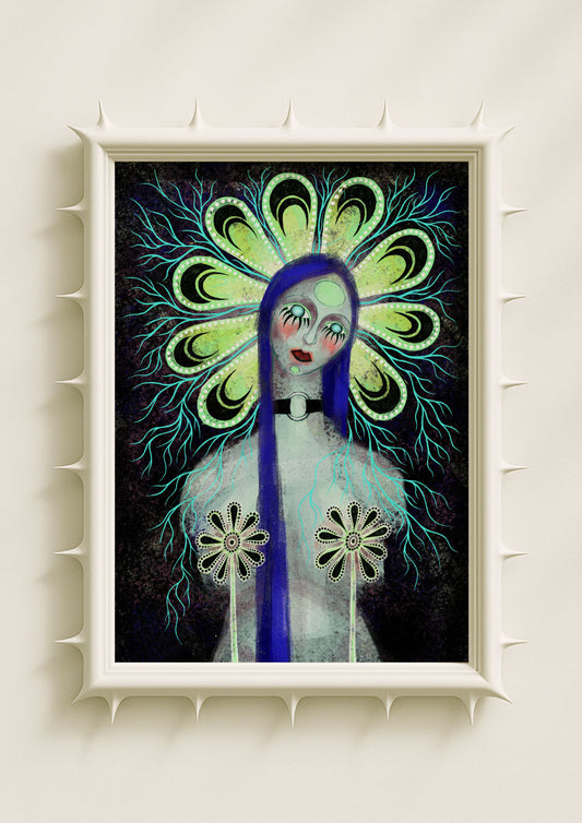
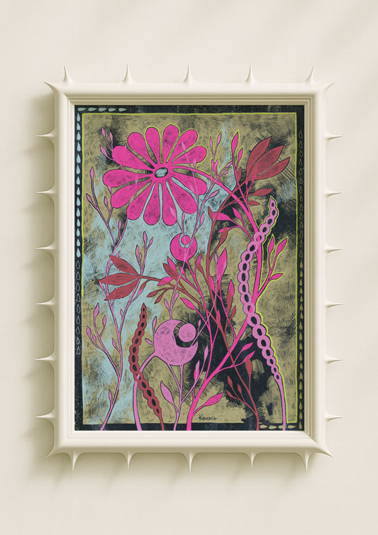
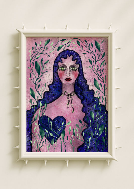
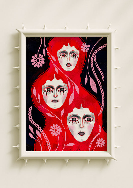
When I look at a blank canvas or screen, the first thing I sense is not shape but atmosphere. Is the internal world warm, sharp, electric, muted, or soft? Emotional colour guides me long before the subject emerges. Hot pink appears as intensity or desire. Lilla becomes introspection. Teal signals balance. Soft black holds depth without heaviness. Acid green pushes the composition toward a more surreal edge. These colours aren’t chosen for symbolism in a fixed way—they respond to the emotional tone I want the portrait to inhabit.

Colour as Frequency, Not Decoration
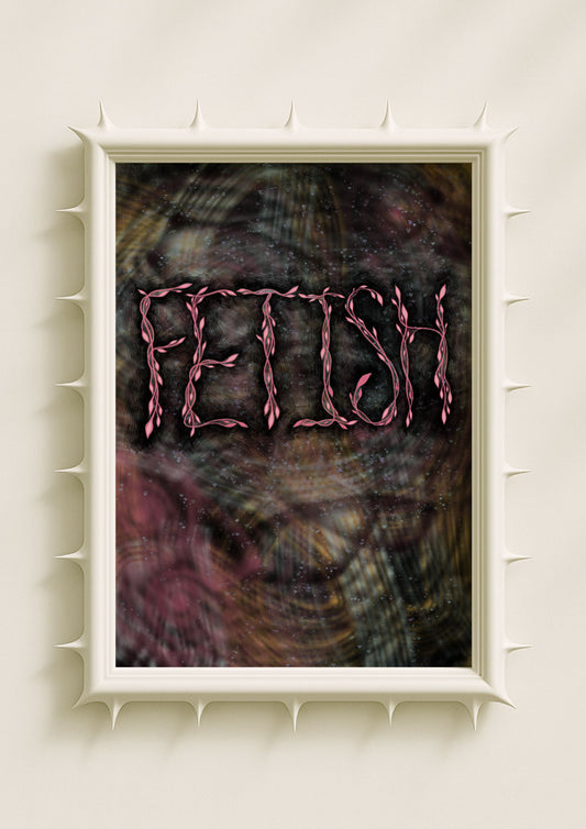
I think of colour as frequency: something that vibrates with a certain psychological resonance. Even small shifts in tone can change the entire meaning of a portrait. A warm pink glow can transform stillness into vulnerability. A sudden streak of teal can steady an otherwise chaotic composition. A wash of green can lift the portrait into something stranger and more atmospheric. Working with an intuitive colour palette means paying attention to these frequencies, responding to them like you would respond to the mood of a person in the room.
The Role of Symbolism in Colour Intuition
Symbolism influences my palette, but not in an academic or rigid way. It lives in the background—quiet but present. Pink often carries emotional heat, but it doesn’t always mean love. Lilac feels spiritual, but it doesn’t have to signal mysticism. Soft black suggests grounding, but not negativity. Symbolism becomes part of the intuitive process, not a set of pre-defined meanings. When a portrait needs strength, softness, clarity, or contradiction, the colours begin shifting toward that direction on their own.

How Surreal Femininity Emerges Through Colour
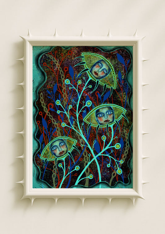
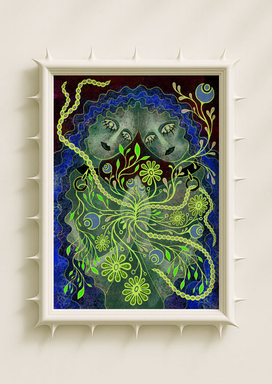
Colour is where surreal femininity enters my work. Many of my portraits rely on unnatural hues: green skin tones, mauve shadows, teal glows, violet contours. These choices push the figure away from realism and into emotional truth. The colour makes her surreal—not in a fantastical sense, but in a psychological one. She becomes someone shaped by inner experience more than by physical resemblance. Intuitive palettes allow this shift to happen organically, without forcing surrealism as an effect.
Inner Glow as Emotional Language
The glow that appears in many of my portraits—rising from cheeks, eyes, petals, or soft shadows—is entirely colour-driven. I let the glow emerge only when the emotional frequency calls for it. Sometimes it becomes a softness; sometimes it becomes a form of intensity. The glow is where colour meets interiority. It’s a way of saying that the emotion comes from within, not from external light. Without an intuitive approach, this luminosity would feel decorative. With intuition, it feels like voice.

Botanicals as Extensions of Colour Emotion
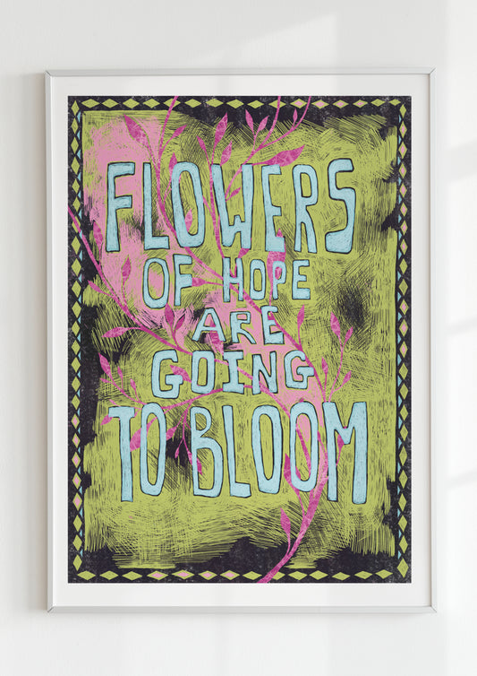
In my botanicals, intuitive colour reveals the emotional logic of the shape. Petals glow when clarity rises. Stems darken when tension forms. Symmetric blooms soften when the palette leans into pastel warmth. These flowers are not naturalistic; they are emotional diagrams. The colours help them function as symbols of growth, tension, and transformation. Working intuitively allows the botanicals to develop atmosphere rather than accuracy.
Why Intuitive Colour Matters in Contemporary Art
Audiences connect with artwork not because it follows rules, but because it carries emotional coherence. Intuitive colour offers that coherence. It gives portraits a tone before the viewer even interprets the expression. It gives botanicals a pulse before the viewer recognises the form. In contemporary art, where inner life and ambiguity are often more central than literal realism, intuitive palettes help shape a space where emotion leads and the viewer can inhabit their own interior landscape through the work.
In this way, intuitive colour becomes a method of artistic decision-making that is both deeply personal and universally resonant—an approach that allows the artwork to speak from emotion first, theory second, and meaning everywhere in between.
