How Bright Colour Redefines Contemporary Femininity
In contemporary art, femininity is no longer confined to softness or delicacy. It has expanded into a language of intensity, nuance, contradiction, and resilience. Bright palettes have become a way to express this multiplicity without relying on traditional feminine tropes. In my surreal portraits, saturated colour never appears as decoration; it functions as emotional vocabulary. Neon pink can communicate urgency and inner heat, cobalt can suggest clarity and distance, acid green can introduce alertness, and lavender can express interiority. When I work with bright palettes, I’m not illustrating femininity; I’m giving it a full emotional register that resists simplification.

Portraits That Balance Sensitivity and Strength
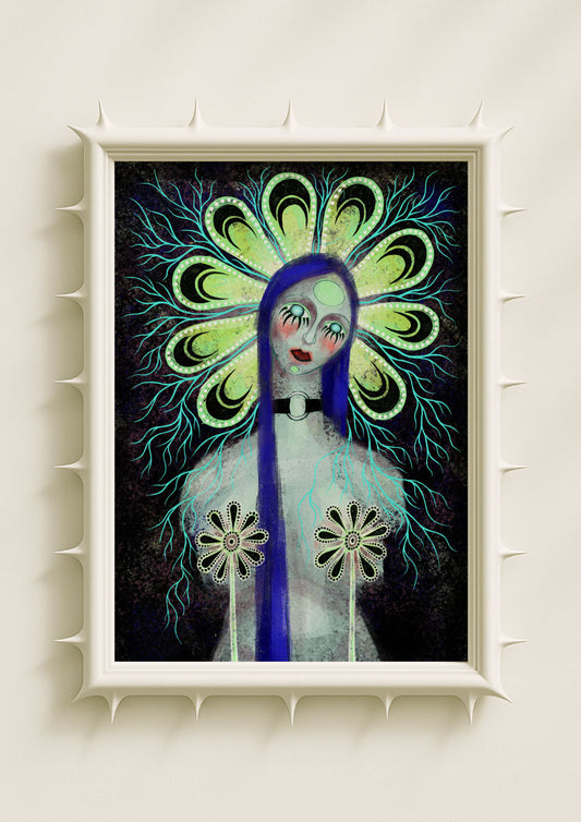
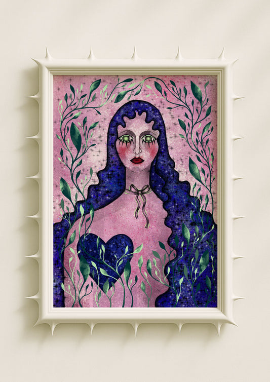
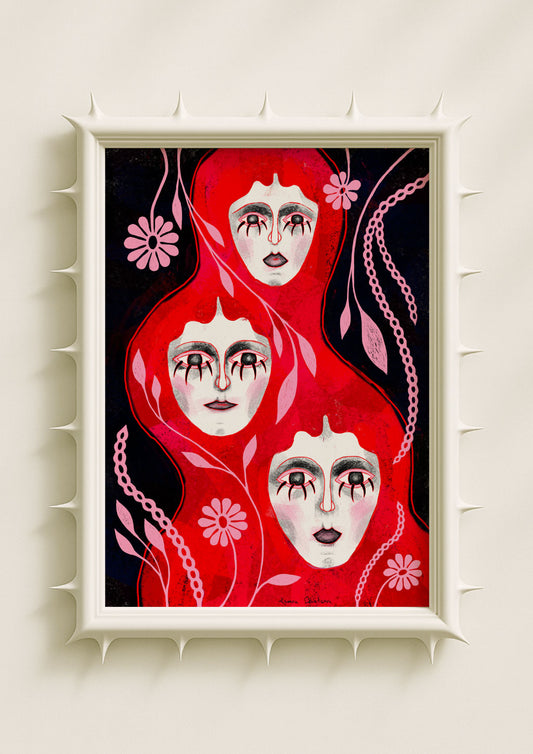
The feminine presence in my portraits often emerges through calm expressions, patterned eyes, and grounded symmetry. The faces tend to be neutral, quiet, sometimes almost meditative, yet the surrounding palette reveals a deeper emotional charge. A teal undertone along the cheek can convey vulnerability, while a violet glow behind the head can signal transition or heightened awareness. Soft black gradients hold tension without hardening the image. This balance matters: the portraits carry sensitivity without fragility and strength without rigidity. Bright colour helps the feminine figure take up emotional space without relying on exaggerated expression or narrative clarity.
Colour as a Feminine Emotional Language
Colour often communicates more quickly than form. For many women—and for me—colour becomes a way to name emotional experiences that do not fit cleanly into linear storytelling. When I build a palette, I think of each hue as part of a conversation between emotional states. A portrait surrounded by warm neon tones feels alive and assertive, while one held in cobalt and soft lavender feels contemplative and spacious. Even a subtle shift toward soft black can create grounding. These combinations allow the feminine to exist as something layered and complex, rather than soft or strong in isolation. Bright colour becomes a language rather than an ornament.

Symbolic Botanicals as Extensions of Feminine Expression
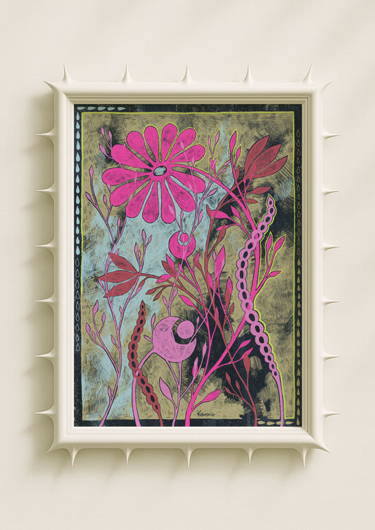
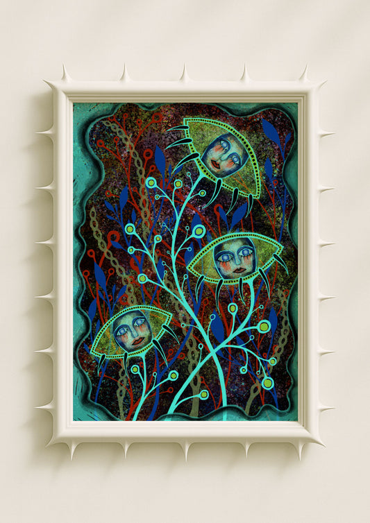
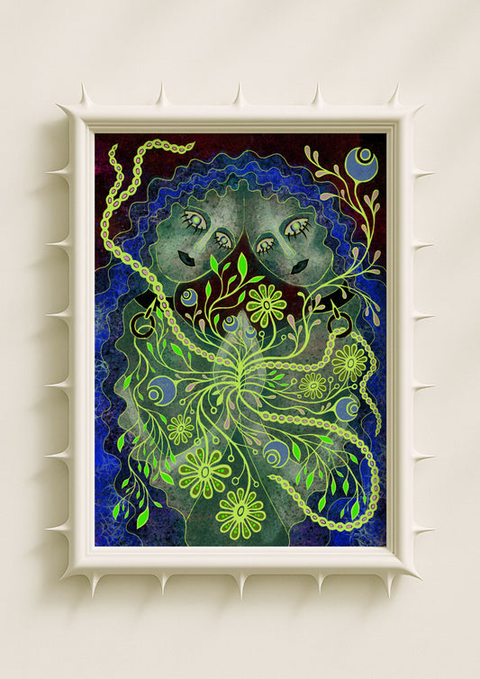
In my work, the feminine extends beyond the figure itself. Symbolic botanicals—mirrored petals, glowing stems, surreal shapes, and dotted halos—carry emotional roles that echo the portrait’s atmosphere. These botanicals do not present femininity as fragile; they show it as rhythmic, adaptive, and continually transforming. When a botanical shape pulses with neon pink, it conveys warmth and immediacy. When petals fade from teal to lavender, they express emotional duality. When soft black touches the edges of a floral form, it introduces stability. The combination creates a world where the feminine spreads outward into the composition, becoming environmental rather than isolated.
Brightness as Visibility, Not Decoration
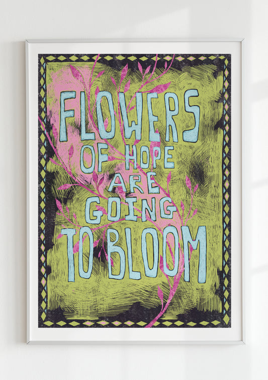
Bright colour has long been associated with femininity, often in reductive ways. It is dismissed as decorative or superficial, as if vivid palettes can only signify lightness or naivety. I push against that assumption. In my work, bright colour becomes a form of assertion. Saturated hues make the feminine figure undeniably present. They refuse smallness and invite the viewer to acknowledge complexity. A portrait built on vivid tones cannot be overlooked or diminished; it stands with its own authority. This presence is not loudness—it is clarity.

Texture as Emotional Grounding
Texture is essential in ensuring that bright colour holds emotional depth rather than appearing slick or surface-level. Grain softens intensity, stains introduce lived history, speckle creates movement, and dusty gradients shape atmosphere. These textures let the palette feel embodied. They allow the feminine interiority to appear layered, thoughtful, and real. In many cases, the texture is what prevents a vivid palette from feeling decorative. It roots the work emotionally and makes the colour feel like part of a psychological landscape.
Surrealism as a Space for Feminine Ambiguity
Surrealism offers the feminine something realistic portraiture often cannot: ambiguity. A surreal face is not obliged to explain itself. It doesn’t need to smile, seduce, or appeal. It can hold meaning quietly, indirectly, and expansively. Patterned eyes become symbols rather than expressions; hybrid features communicate inner states rather than outward identity. The bright palette then serves as a guide, creating an emotional weather system around the portrait. This allows the feminine to exist beyond the expectations of realism—to be shifting, open, complex, and uncontained.

Colour as Agency and Self-Definition
When I use bright colours, I’m not only shaping the emotional atmosphere—I’m allowing the feminine figure to define itself on its own terms. The palette becomes a declaration. It says that sensitivity is not small, that complexity is not weakness, and that visibility is not superficiality. There is a power in being seen fully, not partially. The colourful feminine becomes a visual language for presence, confidence, and emotional honesty.
Why the Colourful Feminine Feels Timely
Today, feminine expression across culture is expanding beyond binaries. It embraces strength and softness, clarity and uncertainty, confidence and vulnerability. Bright palettes reflect this shift. They allow the feminine to be more than one thing at once. In my work, colour becomes a way to hold this expanded identity—to make space for interior experience, symbolic meaning, and emotional depth in the same composition. The colourful feminine is not a trend or a style; it is an evolving emotional vocabulary, shaped through surreal portraiture, symbolic botanicals, atmospheric gradients, and textured intuition.
