How Colour Becomes a Tool for Manifestation in Contemporary Art
Colour in contemporary art has moved far beyond aesthetics. It now functions as emotional intention — a way to shape internal atmosphere, signal desire, or evoke clarity. When I work with bright palettes, surreal gradients, or glowing hues, I’m using colour as a form of manifestation. Each shade channels a different emotional frequency, a different kind of inner movement. Colour becomes a language that makes the invisible feel tangible. In my portraits and botanicals, that language emerges through glow, vibration, and intuitive contrasts that carry intention outward.
Pink as Emotional Heat and Soft Power
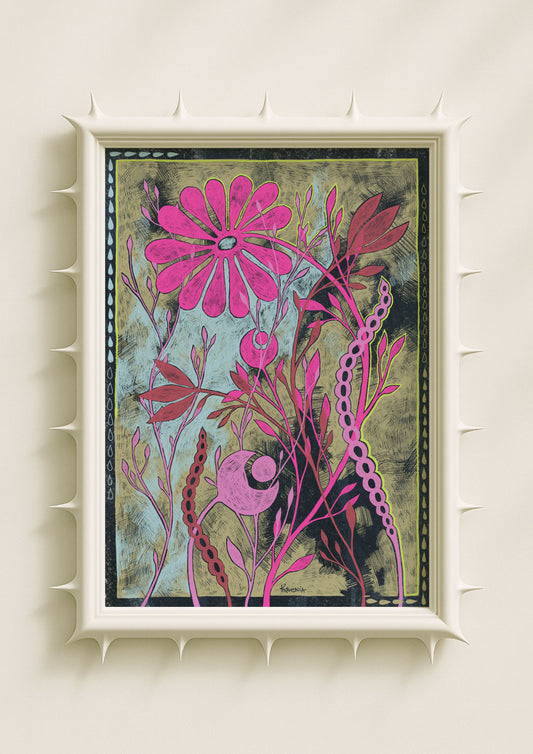
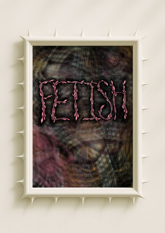
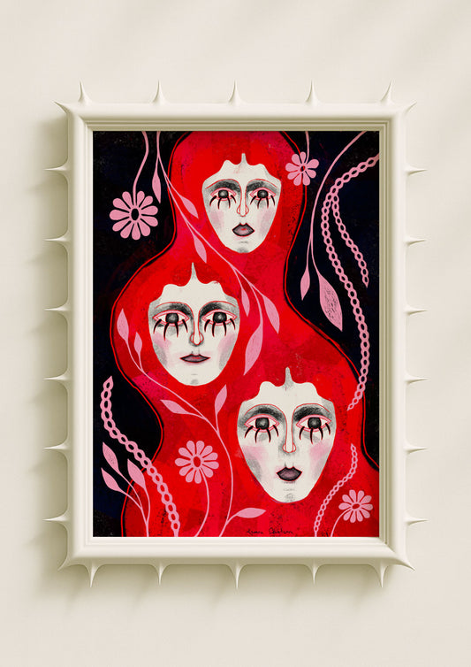
Pink — especially bright pink or hot fuchsia — carries a specific form of emotional heat. It’s not romantic sweetness; it’s energy rising from within. In my work, pink frequently appears as a glow around the face, a blush that radiates, or a botanical edge that feels warm to the eye. This heat becomes symbolic of activation: a spark, a desire, an emotional quickening. Pink channels manifestation by warming the internal landscape, making intention feel alive and immediate.

Teal as Clarity, Calm, and Grounded Presence
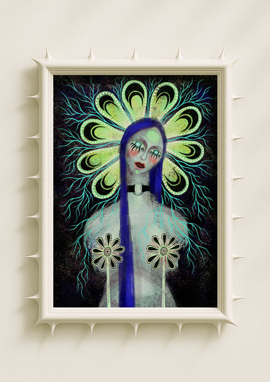
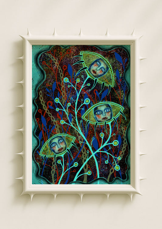
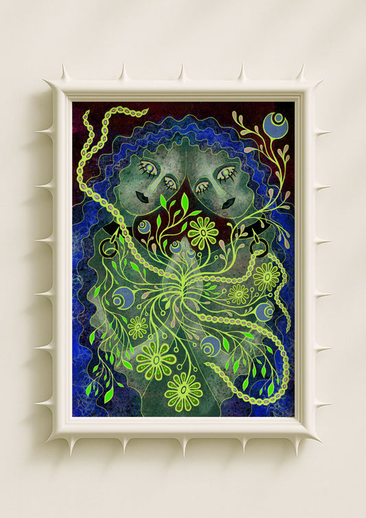
Teal sits in the space between green and blue, which gives it a stabilising quality. It’s one of the colours I use to create clarity — the emotional equivalent of a long exhale. When teal appears as shadow, haze, or a gradient unfolding around a figure, it brings grounded focus. It clears the atmosphere, making room for new intention to form. Teal channels the part of manifestation that requires stillness and steadiness: not the spark, but the alignment.
Lavender as Intuition and Soft Expansion
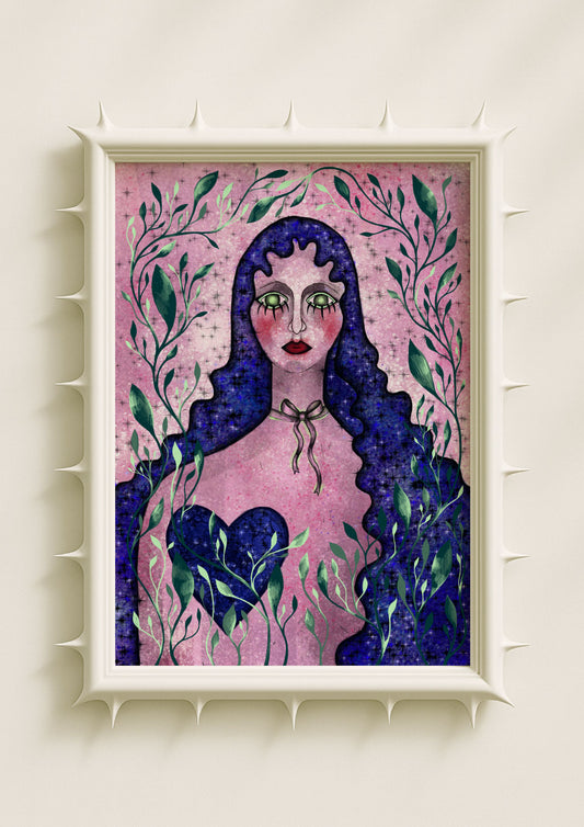
Lavender and lilac carry a gentle sense of openness. They don’t vibrate as intensely as neon hues; they invite instead. When I use lavender in my portraits — often as a soft glow behind the head or a cloud mixed with soft black — it signals intuition and emotional access. Lavender channels a quieter dimension of manifestation, one that asks the viewer to listen inward. It’s the colour of subtle shifts, intuitive insights, and emotional expansion that happens without pressure.

Acid Green as Disruption and Awakening
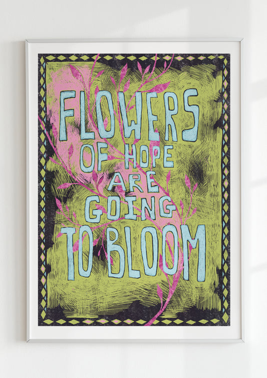
Acid green is one of the most electric colours in my palette. It holds tension, alertness, and a touch of unease — exactly what makes it powerful in manifestation imagery. Acid green interrupts the visual field. It sharpens attention and signals a moment of transformation. When placed along botanical edges or around the eyes, it channels awakening: a jolt that pushes intention out of dormancy. Acid green’s vibration is bold, disruptive, and emotionally catalytic.

Violet as Depth and Emotional Charge
Violet, especially when used in neon or smoky gradients, carries emotional density. It’s a colour associated with depth — psychological, emotional, and symbolic. In my work, violet haze often surrounds portraits, turning the surface into an internal world. Violet channels the emotional weight of manifestation: the desire that isn’t fleeting, the intention that comes from a deeper, more reflective place. It holds contradiction — softness and intensity — which makes it a potent colour for inner change.
Soft Black as Containment and Emotional Structure
Soft black acts as the anchor. It doesn’t diminish the brightness of a palette; it frames it, giving each hue clarity. When I use soft black around neon tones or embedded in botanical forms, it becomes the emotional architecture of the image. Soft black channels the stabilising aspect of manifestation: the grounding needed to support a powerful intention. It brings balance and quiet strength to even the most saturated colours.

How Colours Work Together to Shape Intention
Manifestation isn’t carried by a single colour. It emerges from relationships — pink warming lavender, teal cooling fuchsia, acid green sparking against soft black. These combinations create emotional fields that feel alive. In my portraits and botanicals, the palette becomes a map: heat, clarity, intuition, awakening, depth, grounding. The colours work together to reflect the complexity of internal transformation.
Manifestation as Emotional Light
What makes colour so effective for manifestation in contemporary art is that it turns emotion into visible light. A glowing cheekbone, a blooming neon petal, a radiant line of teal — these are not decorative details. They are signals of internal intention made external. Colour channels the emotional truth that sits beneath words. It invites the viewer into a space where feeling becomes atmosphere, and atmosphere becomes possibility.
In contemporary art, colour is manifestation. It shapes energy, directs attention, and turns the inner world into something luminous, resonant, and alive.
