When Typography Feels Instead of Speaks
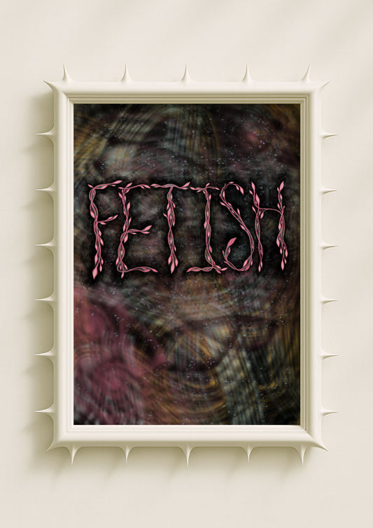
Feminine typography is not defined by prettiness, decoration, or delicacy. Its strength lies in emotional nuance — in the way a letter curves, breathes, softens, or opens. In contemporary artwork, this form of typography becomes a quiet force, shaping the viewer’s emotional experience without announcing itself. Feminine letterforms operate through presence rather than pressure: they invite rather than instruct. This is what I call soft power. It is subtle, atmospheric, and deeply felt, allowing the artwork to speak through intuition rather than assertion.
Feminine Curves as Emotional Architecture
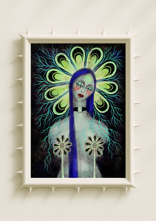
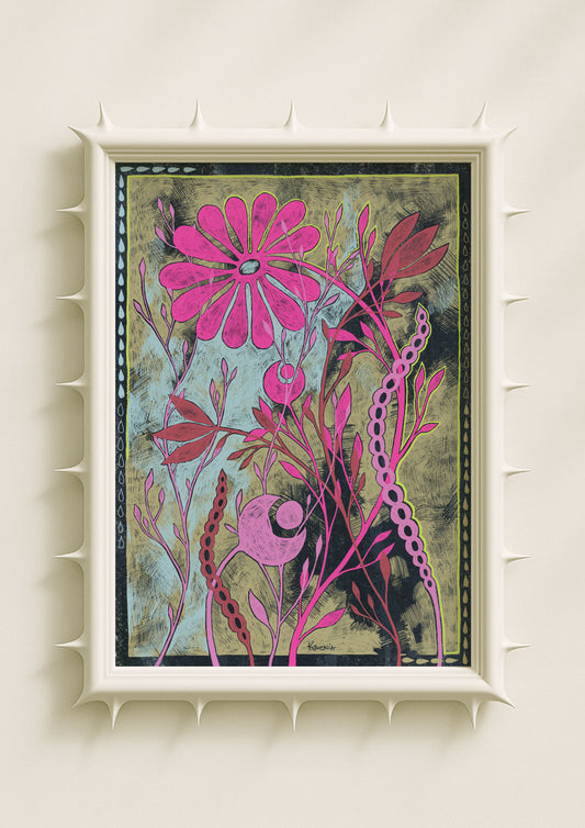
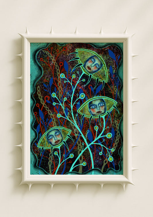
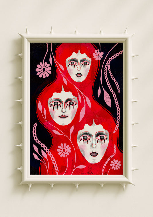
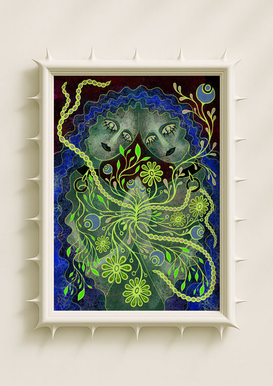
Curved typography carries an emotional softness that feels alive. Round terminals, flowing arcs, and generous counterforms create a sense of fluid motion inside the artwork. These shapes feel less like static letters and more like gestures. They echo breath, pulse, and organic rhythm. In my own practice, I use these curves to mirror the emotional flow present in surreal botanicals, glowing petals, and ritual-like forms. The typography becomes an extension of these shapes — not separate, but harmonised. The result is a visual language where softness becomes structure, and intuition becomes design.

Soft Power Through Negative Space
Feminine typography uses absence as meaning. The space inside and between letters carries the same emotional charge as the strokes themselves. In maximalist compositions rich with grain, shadow, and chromatic motion, these pockets of negative space act like small sanctuaries of quiet. They hold pause, breath, and reflection. This is where soft power lives: in the restraint to let some parts remain open. In a world of loud visuals, these small silences feel radical. They allow the text to influence the artwork without dominating it.
Colour Palettes That Speak in Whispered Frequencies
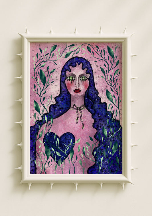
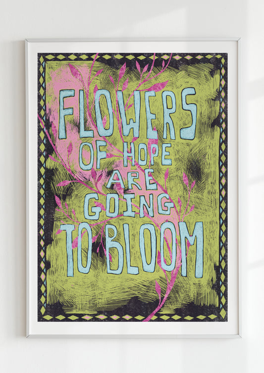
While masculine typography often relies on high contrast or stark monotones, feminine typography thrives in subtle transitions. Soft black gradients, moonglow blues, gentle rose tones, or pollen yellow accents can shift the entire emotional temperature of a word. Colour becomes a form of emotional tuning. A single letter glowing in auric warmth feels nurturing; a word washed in muted violet invites introspection. In my work, I choose colours that act as invitations rather than commands. The typography becomes a frequency — one that the viewer senses before interpreting.

The Sensory Power of Texture
Texture plays an essential role in how feminine typography conveys power. Smooth textures create serenity; grain adds depth and emotional history; blurred edges evoke mystery and softness. When text is lightly dusted with noise or wrapped in a shadowed haze, it feels more human — as though it carries memory or sensitivity. This texture-driven tenderness is part of what makes feminine typography impactful. It captures vulnerability without fragility, expressing emotional depth in a way that feels grounded rather than delicate.
Words as Emotional Ritual Objects
In contemporary art, especially within my symbolic and surreal aesthetic, feminine typography often functions as a ritual object. A single word becomes both symbol and portal. Its softness invites introspection; its form suggests inner resonance. These words don’t tell the viewer what to feel — they create the emotional conditions for feeling to arise. This kind of typographic presence aligns with the logic of visual spellwork: quiet, intuitive, and charged with meaning beneath the surface.
Integration with Botanical and Mythic Imagery
Feminine typography finds an especially natural home in botanical surrealism. Curved strokes echo the lines of petals, tendrils, and roots. The glow of letters resonates with the luminosity of symbolic seeds or mirrored florals. Even spacing mirrors the rhythm of organic repetition. In my pieces, this integration creates a unified emotional ecosystem where letters and plants feel like they grew together. Typography becomes another form of symbolic flora — a soft, intentional bloom inside the artwork’s mythic landscape.

Soft Power as a Contemporary Aesthetic Shift
The rise of feminine typography reflects a broader shift in contemporary art: a move away from dominance and toward emotional intelligence. Audiences are drawn to art that holds them gently, that invites them into atmospheric depth rather than attacking them with clarity. Feminine typography embodies this shift. Its strength is quiet. Its presence is empathetic. Its voice is felt rather than heard. This approach resonates with viewers seeking art that mirrors the complexity of their inner worlds.
Why Feminine Typography Matters Now
We live in a time when softness is often undervalued — seen as decorative rather than powerful. Contemporary art challenges this assumption. Feminine typography demonstrates that softness can be rigorous, intentional, and transformative. It holds emotional truth with clarity and humility. It shapes atmosphere without demanding attention. Through its curves, textures, and subtle colours, it expands what language can do visually. It shows that power can be gentle, and that gentleness can be profound.
