How Colour Becomes a Tool for Manifestation
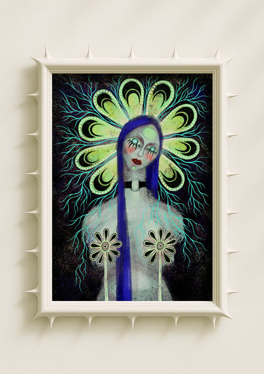
Colour carries intention long before narrative or symbolism come into play. When I work with bright, saturated palettes, I’m not simply choosing what looks striking; I’m shaping an emotional field that influences how the viewer feels, thinks, and imagines. Manifestation through colour is not about magical thinking. It’s about how sensory experiences alter internal states. Bright palettes create the emotional atmosphere where focus, clarity, and desire can rise to the surface. Hot pink, teal, lilac, and acid green aren’t just colours in my portraits and botanicals — they act as emotional frequencies. They transform the image from a visual object into a space that encourages inner movement.
Hot Pink as a Frequency of Emotional Heat
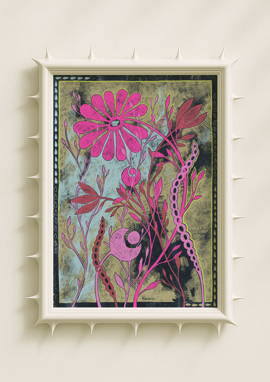
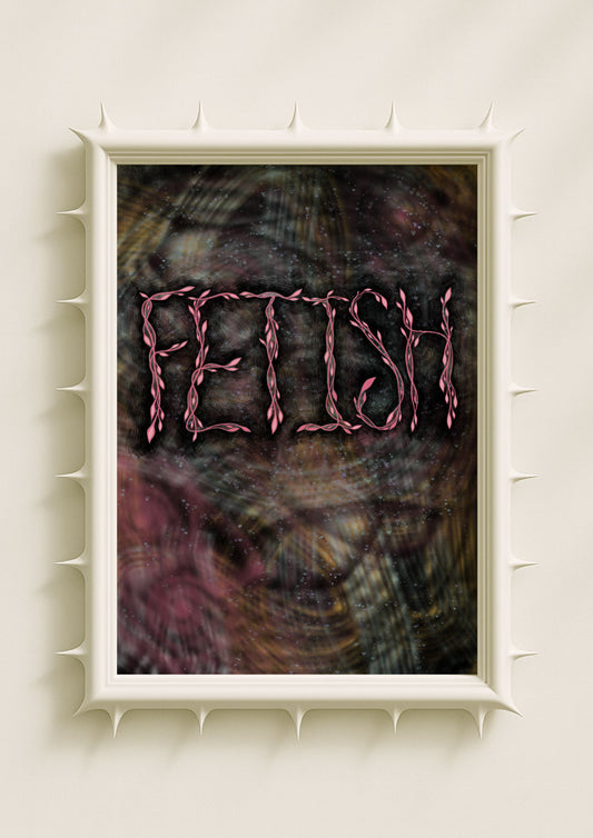
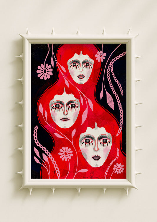
Hot pink is one of the most active manifestation colours in my work. Its saturation creates a feeling of heat that registers emotionally before it registers visually. When I place hot pink along the contours of a face or within a glowing botanical shape, it becomes a symbol of inner ignition. The colour feels like the moment something begins. It suggests desire, urgency, and emotional awakening — the kind of internal spark necessary for manifestation. The vibrancy of hot pink makes the viewer feel closer to their own intensity, making it easier to connect with what they want to call into reality.

Teal as a Field of Clarity and Direction
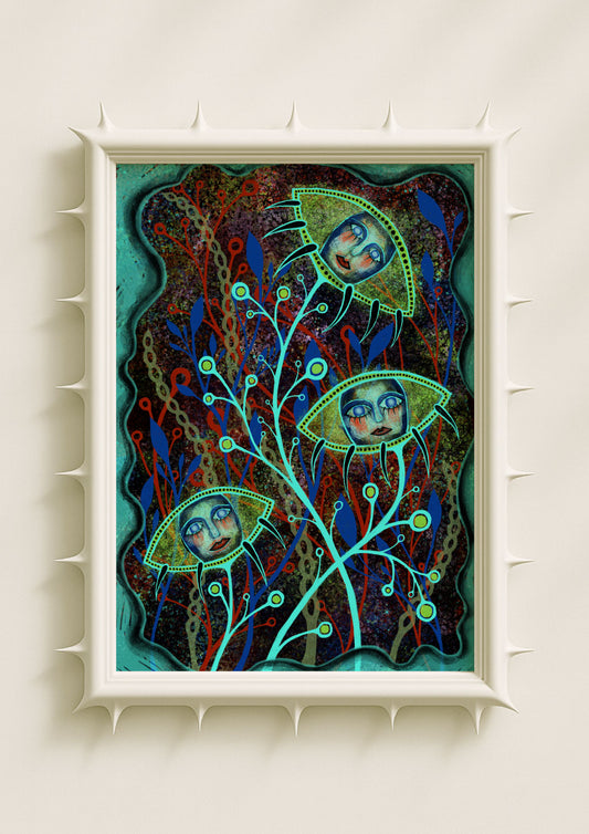
Teal behaves differently. It is cooling, steady, and mentally clarifying. In my portraits, teal gradients often surround the face or settle into the shadows, giving the composition a sense of interior calm. This calm is essential for manifestation because clarity allows intention to become focused rather than frantic. Teal feels like the emotional equivalent of sorting thoughts, clearing noise, and sensing direction. Its presence in the artwork makes space for intention to settle into something coherent. It’s a colour that quiets the emotional surface so deeper desires can be heard.
Lilac as a Soft Portal to Intuition
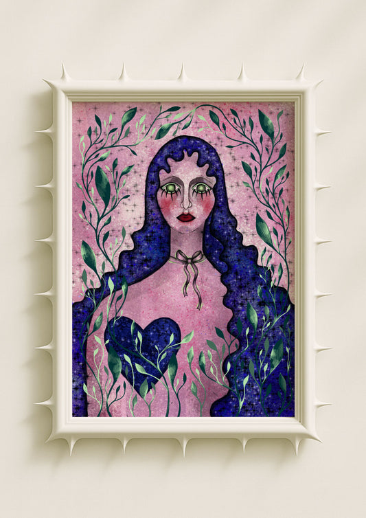
Lilac is one of the most intuitive colours in my palette. When I layer lilac into skin tones or soften botanical petals with lavender haze, it creates an atmosphere of introspection. Lilac carries a natural softness, but it is not passive. It connects emotion to intuition, which is central to the manifestation process. Manifestation requires belief in what is not yet visible, and lilac creates the emotional room for that belief. It opens a space where subtle clarity can emerge. In portraits, lilac becomes the breath between thoughts — the quiet feeling that reveals what the mind hasn’t yet formed into words.

Acid Green as Activation and Disruption
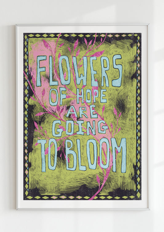
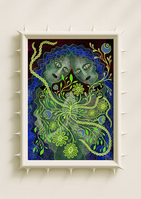
Acid green is the most disruptive colour I use, and for manifestation this disruption matters. Acid green interrupts stagnation. When I outline a botanical form in glowing green or add a flicker of acid tone around a portrait’s edge, it introduces activation. It shocks the image into alertness. Emotionally, acid green represents the moment of decision — the point where intention turns into action. It holds tension, friction, and potential. Manifestation is not always calm; sometimes it requires disruption to move forward, and acid green captures that energy.
Colour Relationships as Emotional Architecture
The way these colours interact with each other creates the emotional architecture of the artwork. Hot pink needs grounding tones to keep it meaningful. Teal needs warmth to avoid detachment. Lilac opens space that acid green quickly charges. I build my compositions through these interactions so the palette itself carries narrative weight. Manifestation relies on emotional balance — clarity, heat, belief, activation — and bright palettes recreate this balance visually. The viewer senses the internal architecture of feeling, even without naming it.

Portraits That Hold Intention
The faces in my portraits rarely express overt emotion. Instead, they hold presence. Colour becomes the carrier of intention. A neutral expression surrounded by glowing pink and teal communicates an emotional environment where something is forming. The viewer enters this space with their own internal narrative, and the colour guides them. In that sense, the portrait becomes a mirrored field for manifestation — an image that reflects what the viewer is trying to create emotionally.
Botanicals as Symbols of Becoming
The botanicals in my work often act as metaphors for manifestation. Their shapes twist, glow, mirror, and bloom in ways that suggest growth and transformation. When hot pink or acid green appears within a botanical gradient, it strengthens the sense of becoming. These plants don’t represent nature literally; they represent emotional processes. A glowing petal or a sharp green outline can feel like the moment a thought becomes intention, or an intention becomes action. Manifestation unfolds in these transitions.

Why Bright Colour Is So Powerful in Contemporary Art
Bright colour feels direct, unapologetic, and emotionally clear — qualities that resonate with people who seek meaning or introspection through art. In a world saturated with ambiguity, bright palettes offer emotional honesty. They don’t hide intensity; they let it radiate. This makes them ideal for manifestation because they give form to feelings that are often unspoken.
Through hot pink, teal, lilac, and acid green, colour becomes a tool for shaping emotional reality — not just in the artwork, but within the viewer’s inner world.
