Luminosity as Emotional Atmosphere, Not Digital Technique
In my artwork, light doesn’t come from special effects. It comes from feeling. The luminosity many people notice — that quiet sense of inner glow — is not created with digital glow tools or overlays. Instead, it emerges from the composition itself: from the way colour interacts with texture, from the contrasts between matte and saturated areas, from the rhythm of tiny marks, and from the symbolic language of radiance built into the imagery. Light becomes emotional atmosphere rather than a technical filter.
Building Light Through High-Contrast Colour Placement
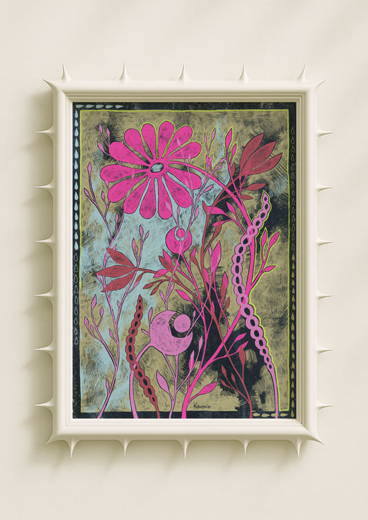
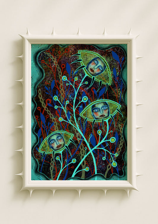
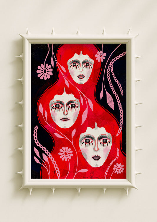
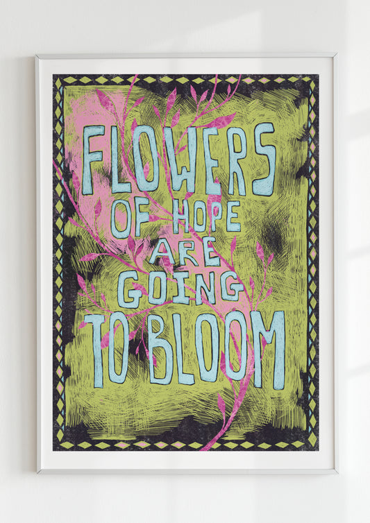
I often place very saturated tones directly beside matte, powdery hues. This creates an optical vibration — a subtle shimmer that feels like light even though nothing is glowing. For example, rich blues or deep reds sit next to pale greens or muted turquoise, causing the eye to register brightness where no highlight exists. This technique lets luminosity emerge naturally from colour relationships, not artificial lighting.

Using Fine Linework to Suggest Radiating Energy
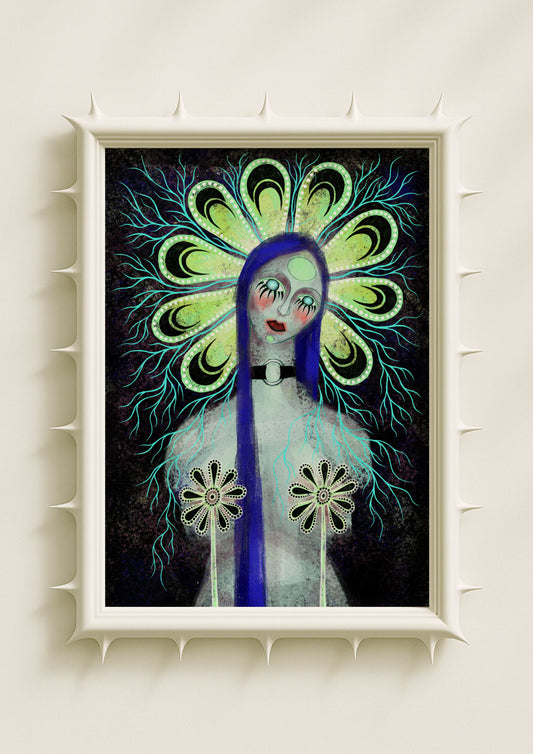
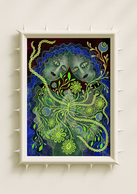
The thin, branching lines around faces or shapes in my work are not just decorative; they act as visual metaphors for energy, aura, or emotional expansion. When these lines extend outward like delicate roots or electrical filaments, the viewer perceives motion and glow. The mind interprets the repeated, radiating patterns as light, even though they are purely structural. The effect feels like illumination, but it is built entirely from shape and rhythm.
Texture as a Quiet Light Source
Much of the luminosity comes from layered texture. I often create rough, speckled backgrounds that contrast with smooth or sharply defined foreground elements. This creates depth and pushes certain colours forward, making them appear lit from within. A soft face against a grainy dark field will always look brighter without adding a glow effect — the eye amplifies contrast and reads light even where none exists.

Symbolic Radiance Instead of Literal Light
The “glow” in my art is also symbolic. Botanical halos, patterned petals, dotted outlines, and circular motifs around the head all mimic the structure of traditional halos but in a surreal, contemporary way. These shapes suggest sacredness or inner illumination, making the figure feel lit from the inside. The effect is atmospheric rather than literal — the luminosity comes from meaning, not physics.
Soft Edges That Create the Illusion of Haze
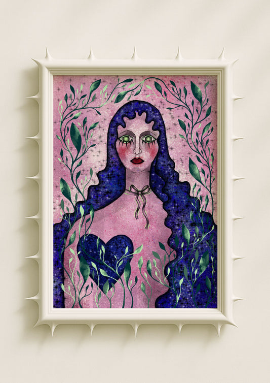
I often let certain edges dissolve into the background while keeping others sharp. This selective softness gives the impression of light diffusing across the surface. When a shape seems to blur into the space around it, it feels as if something is glowing behind it. This is especially true for petals, botanical shapes, and hair — elements that already carry associations with movement and air.
Colour Temperature as Emotional Light
Warm-sided cool colours and cool-sided warm colours create emotional luminosity. Slightly acidic greens, dusty violets, and icy blues with warm undertones create an internal flicker, as if the colour itself were breathing. This temperature play gives the artwork a sense of inner warmth or coldness that feels like light emanating from the piece.

Why My Work Feels Bright Even Without Glow
I want my portraits to feel alive, illuminated by their own emotional or symbolic energy rather than technical effects. The luminosity comes from:
the tension between rough and smooth, the branching lines that mimic radiance, the bold contrasts, the symbolic botanical halos, the softness of edges, the organic rhythm of repeating marks.
Together, these choices create an atmosphere that feels bright, even when the artwork contains no digital glow at all.
