How Colour Shapes Emotional Transformation
Colour is one of the few artistic tools that can shift emotion instantly. Before narrative, before expression, before meaning — colour reaches the viewer first. In my work, emotional transformation often begins with a single hue: a strip of neon, a soft lavender haze, a teal shadow that quietly stabilises the composition. These colours don’t just decorate the portrait or botanical form. They act as emotional states in motion. Through saturation, glow and contrast, the palette becomes a map of inner shifts — from tension to openness, from heaviness to breath, from confusion to clarity.

Teal as Grounding and Emotional Stabilisation
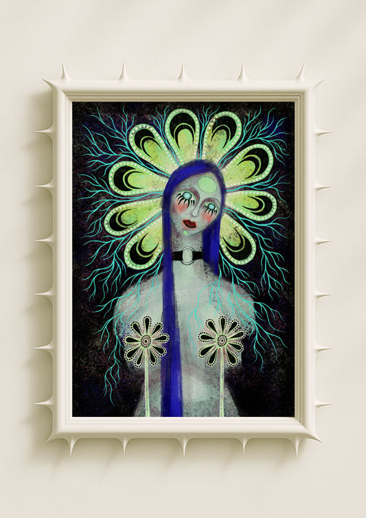
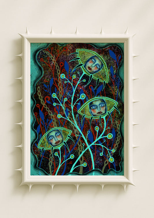
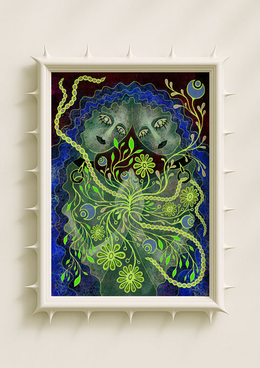
Teal appears frequently in my portraits because it behaves like visual gravity. When I place teal near the eyes, around the shadow lines of the face or within mirrored botanicals, it creates a sense of grounded awareness. The viewer feels held rather than pulled. Teal softens emotional density without flattening it. It represents those moments when the mind settles enough to see the situation clearly. This colour stabilises the composition the same way steady breath stabilises the body — subtly, quietly and with intention. As the first step in emotional transformation, teal creates the foundation.
Pink for Heat, Intensity and Emotional Activation
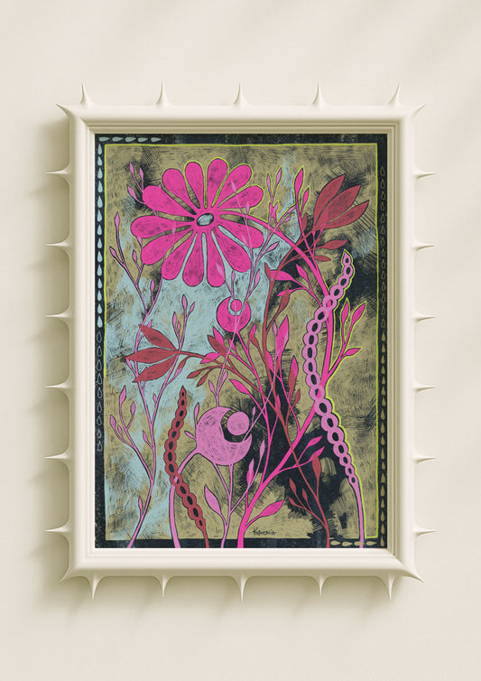
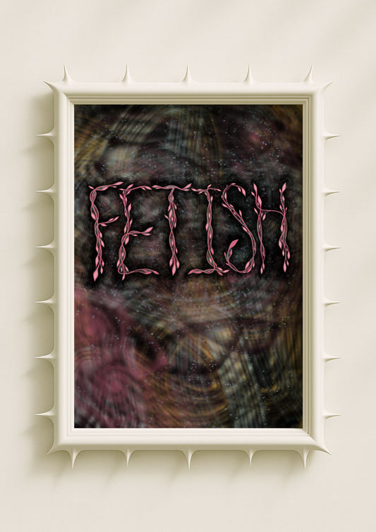
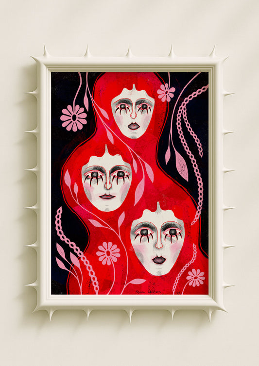
Pink in my palette is rarely pastel. It leans toward hot, saturated, glowing pink — the kind that radiates from within the portrait or blooms inside a botanical core. This pink carries emotional heat. It suggests inner friction, desire, longing or urgency. Pink appears when something is stirring. It pushes the composition outward, introduces energy and disrupts calm surfaces. In emotional terms, pink marks the moment when feeling becomes impossible to ignore. It is not aggression, but intensity — an internal spark that begins the shift from stillness toward transformation.

Lavender as Openness and Receptive Space
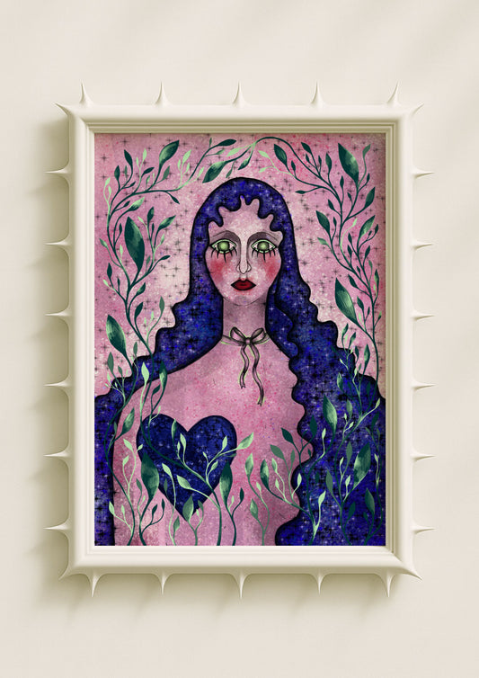
Lavender plays the role of emotional softening. When I use it as haze behind the figure, or as a gradient across the cheeks, it opens the emotional space of the artwork. Lavender lowers resistance. It makes room for nuance, vulnerability and intuition. This colour often appears after the initial heat of pink — after the intensity rises and the viewer needs space to breathe. Lavender is the emotional moment when something unravels gently. It signals openness, the willingness to feel without defensiveness. In the transformation arc, lavender is acceptance.

Neon as Awakening and Disruption
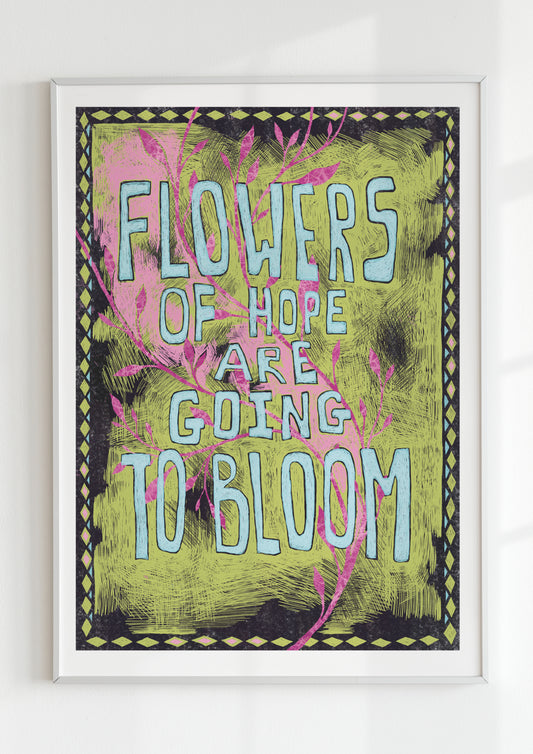
Neon colours — acid green, electric violet, bright fuchsia — appear like sparks inside my compositions. They interrupt. They wake the eye. Neon behaves like sudden clarity or sharp insight: something that was previously blurred becomes unmistakable. These hues sit at the edge of comfort, adding friction that feels alive rather than chaotic. When neon accents surround a botanical shape or highlight the contours of a face, they represent emotional awakening — the moment when inner truth comes into focus. Neon doesn’t soothe; it reveals.
Atmospheric Movement: How Colours Interact
Emotional transformation rarely moves in a straight line, and neither does colour. Teal grounds the portrait while pink pushes upward. Lavender makes space, while neon cuts through illusion. When these colours overlap — when a pink glow melts into teal shadow or a lavender mist carries a neon pulse — the artwork enters a state of emotional complexity. These interactions mimic real internal transitions: messy, layered, non-linear. The portrait becomes an emotional weather system rather than a fixed image.

Texture as Evidence of Transformation
Colour alone carries emotional meaning, but texture gives it memory. Grain, soft scratches, micro-speckles and subtle cracks allow colour to feel lived-in rather than polished. These textures reflect the struggle within transformation: the marks of tension, the remnants of past states, the interruptions that shape new clarity. Texture ensures that the emotional shift doesn’t feel pristine — because no real transformation ever is.
Why Colour Reaches the Emotional Core Faster Than Narrative
Colour bypasses the analytical mind. Instead of asking the viewer to interpret, it invites them to feel. This is why emotional transformation is so often visible in the palette before the composition or symbolism. The viewer senses grounding in teal, heat in pink, openness in lavender, awakening in neon — all without needing explanation. These associations aren’t theoretical; they’re instinctive.
In my work, colour becomes an emotional trajectory. It traces the inner arc from tension to clarity through saturation, glow and contrast, revealing that transformation is not a sudden shift but a spectrum of states held together in the same luminous space.
