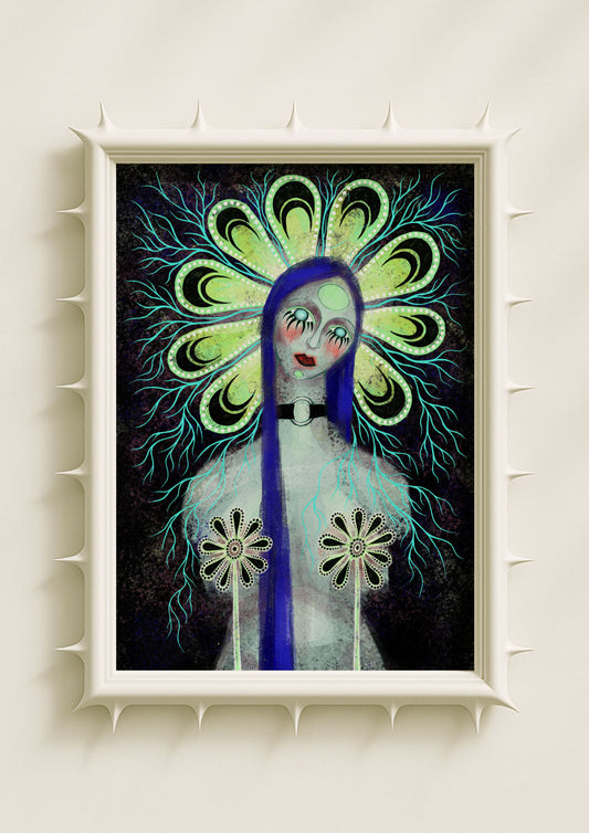
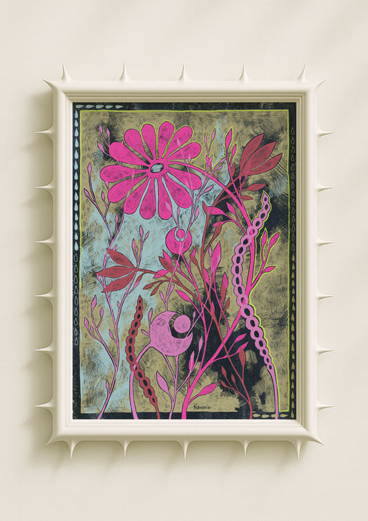
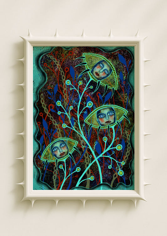
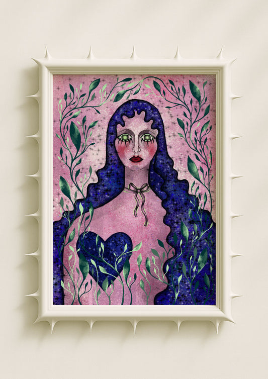
Darkness has always had its own language. From the handwritten lyrics of punk zines to the baroque shadows of fine art, the dark poster carries a visual power that transcends genre. It’s more than design — it’s identity. What began as underground expression for music and counterculture has now become one of the most enduring aesthetics in contemporary visual art.
Today, dark posters don’t just decorate walls; they signal emotion, taste, and alignment with a certain worldview. They borrow from the past but speak to the present — balancing elegance and defiance, precision and raw energy.
The Roots: Subculture and Rebellion
The story of dark posters begins far from galleries — in rehearsal basements, small venues, and photocopy shops. In the late 20th century, punk, metal, and gothic scenes used poster design as a visual manifesto. Rough prints, grainy photocopies, and heavy black inks became tools of resistance — immediate, handmade, unapologetic.

These images didn’t aim for beauty in the traditional sense. They aimed for presence. Torn edges, distressed fonts, and chaotic layouts became emblems of freedom. Each poster was both advertisement and declaration — a symbol of community formed around shared darkness.
This raw authenticity still shapes how we see dark art today. What began as rebellion against the mainstream has evolved into an aesthetic that celebrates intensity, individuality, and emotion.
Gothic Typography: The Art of Weight and Rhythm
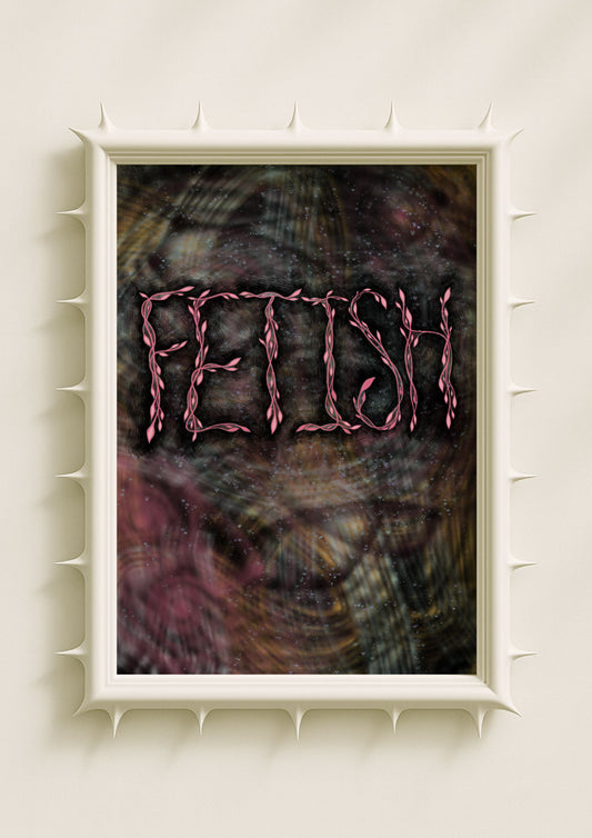
Typography is one of the strongest visual signatures of dark design. Gothic and blackletter fonts, once associated with religion and authority, were reclaimed by underground cultures as signs of independence and mystery. Their sharp lines and rhythmic density became a visual equivalent of bass and distortion — commanding yet ornamental.
In my own work, I often think about type as architecture. The weight of a letterform can shape the mood of an entire image. A serif too thick, a curve too sharp — and suddenly the word becomes sculpture. This play of density and emptiness gives gothic typography its ritual quality.
What’s fascinating is how this once rebellious style has entered fine art and high fashion. The same blackletter forms that once adorned punk posters now appear in gallery titles, tattoos, and album covers, carrying both history and irony. They remind us that darkness never stays underground for long — it gets reinterpreted, refined, reimagined.
From DIY to Fine Art
As printing evolved and subcultures matured, dark poster design moved from ephemeral street culture into the realm of collectable art. What was once glued to a club wall now hangs in curated interiors. The transition didn’t dilute its power — it gave it permanence.
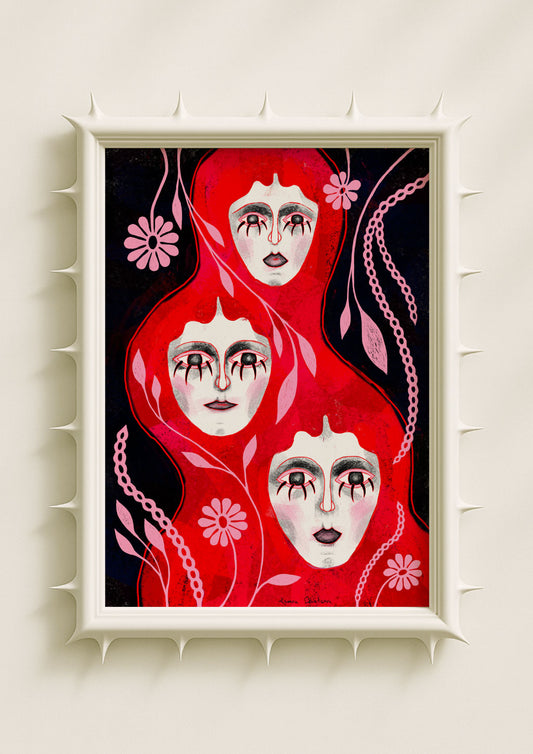
Artists began treating poster aesthetics as conceptual language: repetition, layering, distressed surfaces, and stark contrast became subjects rather than byproducts. In minimalist homes, a single dark art print acts almost like an icon — modern, symbolic, and meditative.
I love this transformation — how something born out of raw urgency can become contemplative. It shows how rebellion, once visual noise, can evolve into quiet sophistication without losing authenticity.
The Symbolic Depth of Darkness
Darkness in art isn’t absence — it’s depth. It carries the weight of emotion, memory, and ritual. From Caravaggio’s chiaroscuro to Bauhaus poster contrasts, black has always been the color of focus. It sharpens perception. It slows the eye.

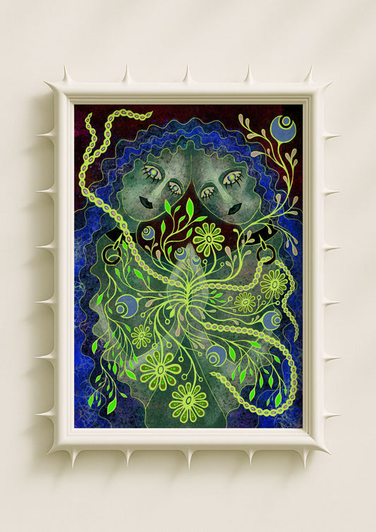
When I work with dark tones, I think about shadow as space rather than background — as something that holds meaning. It’s where tension lives. A dark composition invites reflection; it demands more than a glance. That’s why dark posters resonate so strongly in contemporary interiors — they quiet the visual noise of modern life and replace it with mood.
A New Kind of Iconography
In today’s culture, where visuals are consumed at high speed, dark posters stand out precisely because they don’t seek approval. Their restraint, texture, and mystery give them an almost sacred aura — a form of modern iconography.
They connect rebellion and refinement, underground and art history, DIY and digital precision. Each piece carries traces of both the club wall and the museum — the immediacy of subculture and the timelessness of fine art.
In that blend lies their strength. Darkness, after all, has never been about negativity — it’s about contrast. It’s the visual language of honesty, depth, and presence. And that makes it endlessly modern.
