Colour as the Silent Ritual of Tarot
In tarot, colour is never accidental. It carries emotional temperature, spiritual direction, and symbolic potency. A single hue can shift the meaning of a card, intensifying its message or softening its tone. When I create my surreal portraits and botanical forms, I treat colour in the same way—a quiet ritual that channels internal states into chromatic language. The dotted halos, glowing contours, and luminous centres in my work echo the way tarot uses colour to transmit intention and energy.

Red as Activation, Desire, and Inner Fire
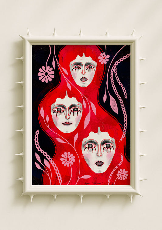
Red in tarot is the colour of movement. It marks the urgency of The Magician, the ignition of The Tower, and the raw vitality flowing through the Wands suit. In my art, red behaves like a pulse. It appears in soft glow around a face, in botanical filaments, or in surreal shadows that feel charged from within. Red becomes a signal of emotional heat—desire awakening, truth rising, a decision vibrating through the body before it becomes action.

Blue as Intuition and the Subconscious
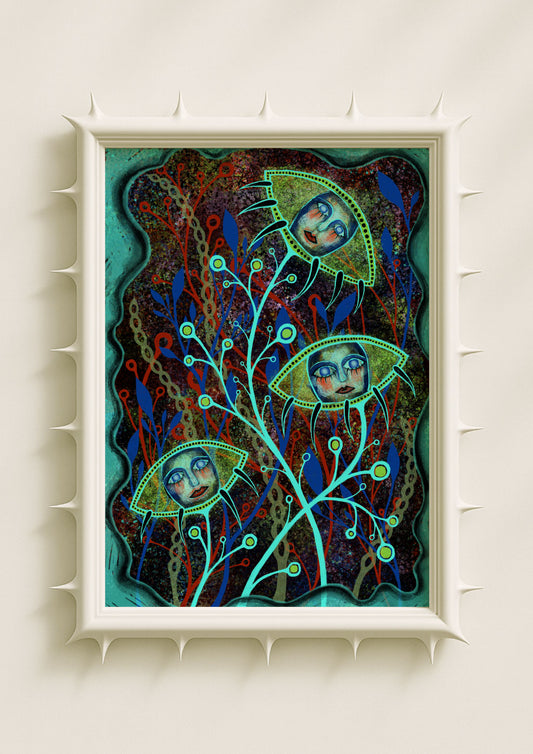
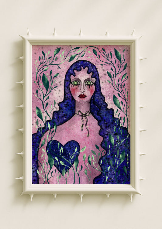
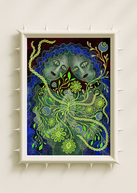
Blue is the domain of The High Priestess, The Moon, and water energy. It represents memory, intuition, and dream-state knowledge. Much of my palette leans into deep blues and glowing ultramarines that create an atmosphere of quiet depth. When faces emerge from blue backgrounds or botanicals shimmer with blue light, the work enters the territory of the subconscious. The colour behaves like the gentle pull of an inner voice, guiding perception inward.

Green as Healing and Hidden Intelligence
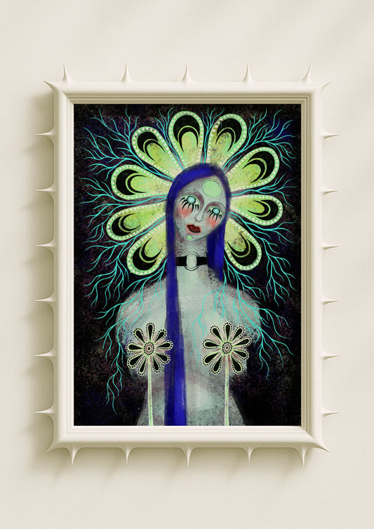
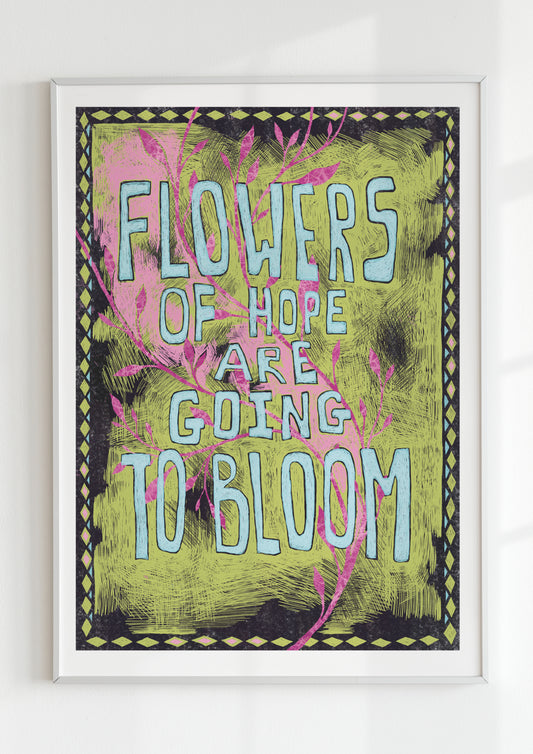
In tarot, green often appears in cards that speak of growth, restoration, and intuitive intelligence—qualities associated with Earth energy and with the Empress. I use green with this same sensibility. Acid greens signal transformation through discomfort. Soft mossy tones suggest renewal. Bright verdant hues woven into botanical shapes become symbolic pathways of healing. Green carries the quiet message that emotional landscapes can regenerate.

Pink as Vulnerability and Open-Heartedness
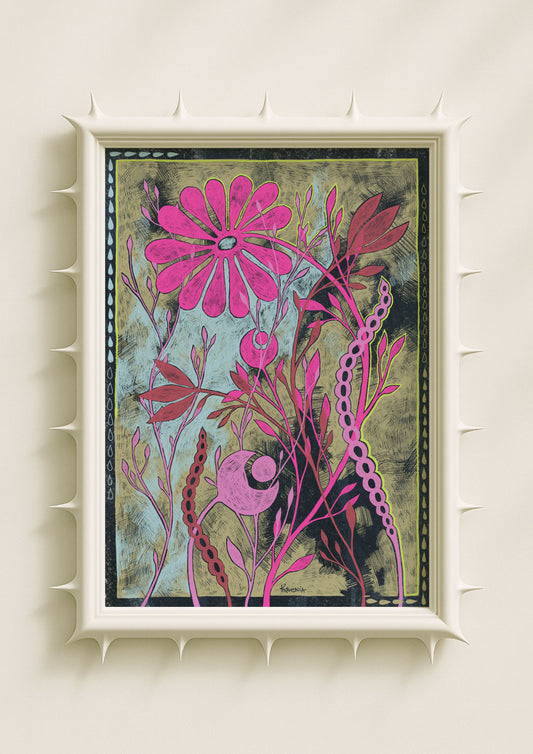
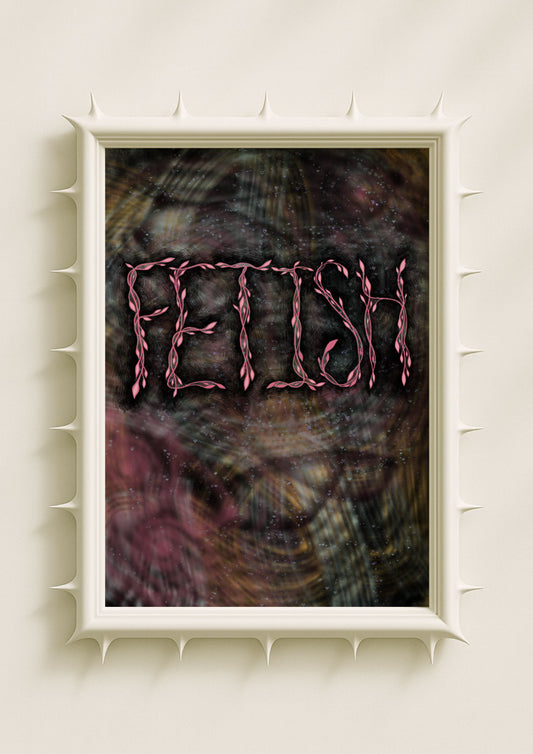
Pink, while used less explicitly in traditional tarot decks, has become a contemporary symbol of emotional openness. In my surreal work, luminous pinks form a gentle field around portraits, softening intensity and introducing tenderness. Pink halos are like invitations—moments when the emotional body unguards itself. It is a colour that turns fragility into strength, echoing the heart-centred cards of the tarot’s cups.

Yellow and Gold as Illumination
Tarot’s golden tones—seen in The Sun, The Star, and The Wheel—symbolise clarity, harmony, and spiritual coherence. In my pieces, golden hues often appear as dotted halos or radiant botanical cores. They function as quiet beacons within the composition, signalling moments of alignment or insight. The light feels ceremonial, as if the portrait or plant is participating in a personal ritual of understanding.

The Halo as Colour Ritual
The dotted halos surrounding many of my figures draw directly from the idea of colour as ritual energy. In tarot, light rings, borders, and radiant fields often frame insight or reveal an archetype’s power. My halos behave similarly: they illuminate the emotional tone of the portrait. A red halo intensifies emotional pressure. A blue one deepens contemplation. A green one invites change. The halo becomes a ritual boundary, defining the emotional atmosphere the viewer steps into.

Botanical Light as Chromatic Spellwork
Surreal flowers, seeds, and mirrored stems in my art often carry their own illumination, glowing from within. This inward shine resonates with tarot’s treatment of colour as a form of activation. Light reveals meaning; colour directs it. When a flower glows bright pink or acidic green, it becomes an emotional spell—an image charged with symbolic intent.

When Colour Becomes the Message
The magic of tarot lies in the way colour speaks before words. In my surreal portraits and botanicals, I approach colour with the same philosophy. Instead of illustrating a literal scene, I let the palette express the atmosphere of the inner world. Crimson tension, blue intuition, pink vulnerability, and gold clarity work together as a chromatic ritual, shaping how the viewer feels rather than what they see.
