Why Blue Feels Expansive in Contemporary Art
Blue in contemporary art has a way of opening emotional space. It creates room around the image rather than pressing inward, and that sense of spaciousness is something I rely on often in my own work. Whether I use dusty blue, cobalt, teal, or powder tones, blue gives the composition a kind of internal breath. It brings quiet without emptiness and depth without heaviness. When I introduce blue into a surreal portrait or botanical structure, it shapes the mood with a steadiness that other colours rarely offer. Blue feels like a pause—one that lets the viewer settle into the piece at their own pace.

Stillness as Emotional Presence
For me, blue is the colour of emotional stillness. It doesn’t erase feeling; it clarifies it. When I place a surreal face on a blue background, the calmness becomes more legible. Powder blue creates a softened, dreamlike environment; cobalt gives the stillness weight; teal introduces a slow, rhythmic mood that feels grounded. Many artists use blue to quiet the atmosphere of a piece without draining it of emotion. In my practice, blue often appears when the artwork needs to hold presence gently—without intensity, without urgency, just a stable emotional field where the viewer can listen rather than react.
Distance Without Detachment
Blue also introduces a sense of distance, but not the cold, isolating kind. It’s more like perspective—an emotional buffer that creates comfort. In a surreal portrait, blue makes the face feel approachable but not exposed. In botanical work, blue tones create thoughtful separation between form and background. Distance becomes a tool rather than a barrier. When I use pale or muted blues, the artwork feels slightly lifted from everyday reality, as if it exists in a quieter layer of experience. This distance helps the viewer step into the artwork without feeling pushed or pulled.

Cobalt Blue’s Bold Calm
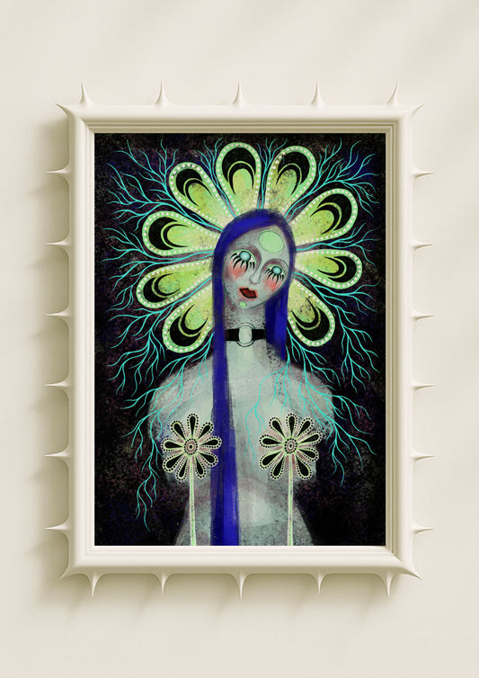
Cobalt is one of the blues I return to most often because it carries strength and calm at the same time. It deepens the emotional register of a portrait without overwhelming the composition. A cobalt halo suggests concentration; a cobalt stain in the background steadies the entire image. In contemporary art, cobalt is often used to create presence—something solid, grounded, and introspective. I turn to cobalt when a piece needs stability, when the surreal forms feel too light, or when I want to anchor the mood.
Powder Blue and Soft Surrealism
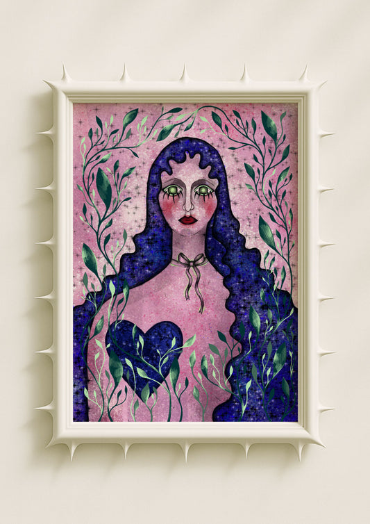
Powder blue supports the quieter side of surrealism. It lets symbolic elements—patterned eyes, mirrored petals, hybrid botanical forms—float gently without losing structure. When textured with grain or a dusty gradient, powder blue becomes atmosphere instead of surface. It adds softness without dissolving the visual logic of the piece. For many female indie artists, powder blue is a way to express vulnerability in a balanced, controlled way. In my own work, it becomes the colour of emotional honesty, a backdrop that holds the portrait steady without amplifying or diminishing its expression.

Teal as a Transitional Emotion
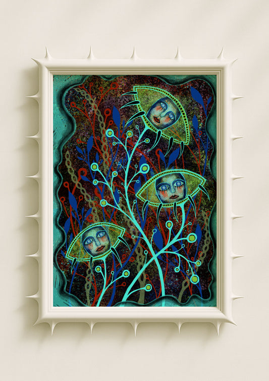
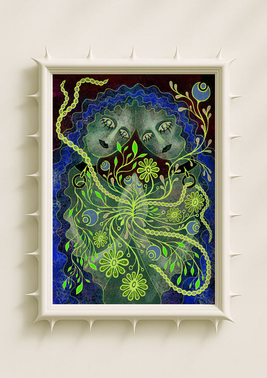
Teal sits between the emotional openness of blue and the organic warmth of green. It’s a transitional colour—one that carries movement even in quiet scenes. I use teal when I want a piece to feel introspective but alive. It supports surreal portraiture by adding depth to the face and grounding the botanical elements. When combined with texture, teal creates an atmosphere that feels both contemplative and shifting, as if the scene is in the middle of a quiet transformation. In contemporary art, teal often marks this in-between space where multiple emotional tones coexist.
Texture Shapes the Meaning of Blue
Blue becomes more human once texture is involved. Grain warms it. Speckle creates rhythm. Stains and dusty gradients turn it into emotional weather rather than a flat field of colour. In my work, blue rarely appears without texture because texture carries memory. A grainy blue backdrop feels like sky and skin at once. A stained blue wash makes the surreal portrait feel lived-in rather than distant. Texture makes blue intimate, grounding its stillness in something tactile.
Botanical Symbols Through Blue Tones
Blue botanicals shift the emotional meaning of the floral symbol. Instead of vitality or brightness, they suggest reflection. A surreal blue flower outlined in neon feels illuminated from within; a dusty blue petal feels soft and contemplative; a mirrored blue botanical shape becomes a metaphor for quiet transformation. In contemporary art, blue flora often signals introspection rather than decoration. When I use blue in botanical forms, it becomes a way of expressing slow emotional movement, almost like a private growth happening beneath the surface.
How Blue Defines My Visual Language
Blue is one of the colours that most clearly shapes the atmosphere of my work. It gives my surreal portraits and symbolic botanicals a steady emotional foundation. It creates clarity without harshness and stillness without emptiness. It lets me communicate internal states without overstating them. Blue is where my quieter thoughts take visual form. It’s the colour I turn to when I need honesty, when I need atmosphere, and when I want the artwork to feel spacious enough for the viewer to enter without pressure.
